AbstractTUI API Guide
A guided tour of the public API, module by module. This is not a reference —
the item-by-item rustdoc is the reference (cargo doc --open, or browse
docs.rs). The goal here is orientation: what
each module is for, the types you will actually touch, and the idioms the
engine expects. Snippets are lifted from the crate’s compiled doctests
wherever possible, so they match the shipped code.
The prelude
use abstracttui::prelude::*; is all an application needs for the common
path. The prelude is curated to the app-code surface only: engine and test
types (UiTree, Driver, create_root, canvases) stay behind explicit
imports. One deliberate absence: render::Style is not exported, because two
Style types one glob apart is a trap. Layout style is exported as
LayoutStyle (box geometry — direction, size, gap); paint style is spelled
render::Style in full, inside draw closures, where it belongs.
reactive — signals, memos, effects
Signal<T> is tracked state, Memo<T> is derived state, and an effect is a
computation that re-runs when anything it read changes. Handles are Copy;
state is owned by the Scope that created it and dies when that scope is
disposed. batch coalesces writes so effects observe one consistent world;
untrack reads without subscribing. The model in one compiled example:
#![allow(unused)]
fn main() {
use abstracttui::reactive::{batch, create_root};
use std::{cell::RefCell, rc::Rc};

let log = Rc::new(RefCell::new(Vec::new()));
let (root, ()) = create_root(|cx| {
    let count = cx.signal(0);
    let doubled = cx.memo(move || count.get() * 2);
    let log2 = log.clone();
    cx.effect(move || log2.borrow_mut().push(doubled.get()));
    count.set(3);
    batch(|| {
        count.set(4);
        count.set(5); // coalesced: the effect sees only 10
    });
});
assert_eq!(*log.borrow(), vec![0, 6, 10]);
root.dispose();
}(create_root is the standalone entry point; inside an app, App::mount
hands your component a ready Scope.) Two time-aware helpers round out the
module: animate(cx, source, easing, duration) returns a signal following
source through eased transitions (settled values cost zero frames), and
after(delay, f) runs a one-shot closure on the UI thread, costing zero
wakeups until due.
Timers arm AND fire against the loop’s clock, never a stray wall-clock
read: inside a driven turn the driver publishes its (injectable) clock,
so one injected test clock scripts after/interval deadlines end to
end (an after(0) armed under an injected timeline comes due on that
timeline, even when real time has raced ahead). Custom loop authors
driving run_due_timers(now) publish the same value around their
user-code phases with reactive::set_loop_clock(Some(now)) — the
driver does this automatically — and None restores real-time arming
for bare rigs.
reactive::connection — lifecycle + jittered reconnect
connection(cx, backoff, dial) owns what every networked app
hand-rolls around its transport: the state vocabulary, the retry
schedule, the armed retry timer, and cancellation. The engine does NO
network I/O — dial runs on the UI thread once per attempt, spawns
the app’s transport work (spawn_worker plus the HTTP client, socket,
or subprocess of your choice — the transport stays the app’s call),
and reports through the Clone + Send ConnectionEvents reporter:
connected(), degraded(reason), failed(reason), closed()
(clean, terminal). Reports apply on the UI thread in the next phase U;
reports from a SUPERSEDED attempt (a zombie worker racing the retry
that replaced it) or after close are inert and counted
(stale_reports, the dead_sends convention). Workers poll
is_closed()/is_current() as their stop conditions.
conn.state() is a Signal<ConnState> the UI renders like any other:
Connecting, Connected, Degraded(reason), Reconnecting { attempt, next_in } (render “retry #2 in 1.4s” from the fields),
Closed — a closed vocabulary by design (transport semantics must not
grow into it). conn.close() is the UI-side terminal close;
conn.retry_now() skips a pending wait; scope disposal closes, cancels
the armed timer, and drops the dial fn.
Backoff is the pure schedule: FULL jitter — uniform in [0, min(cap, base × 2^attempt)] — with defaults base 500 ms, ×2, cap
30 s, reset() on success (the machine calls it on connect), and
seeded(n) for deterministic tests. Jitter is not optional
politeness: un-jittered fleets retry in lockstep after a server
restart (the thundering herd). While reconnecting the loop stays
parked — the one armed one-shot costs zero wakeups until due, and a
Closed connection costs nothing forever (test-pinned). See
live-data.md § “Connection lifecycle”
for the state diagram and a worker-thread example.
ui — elements, views, composition
Element is the view-tree builder: layout style, children, focusability,
event handlers, keyboard shortcuts, an optional draw closure, and an
optional intrinsic measure (.measure(fn(Size) -> Size)) so a draw
widget can answer Auto sizing like a text leaf instead of defaulting
to zero.
Components are plain functions fn(Scope, Props) -> View — no trait, no
registry. They run once; reactivity comes from dyn_view(style, f),
which re-runs f when the signals it reads change and re-renders only that
region. Props structs carry data fields, Callback<T> fields for typed
events out, and View fields as slots for children:
#![allow(unused)]
fn main() {
use abstracttui::prelude::*;
use abstracttui::widgets::Button;

struct CardProps {
    title: String,
    on_close: Callback<()>, // typed event out
    children: View,         // slot
}

fn card(cx: Scope, props: CardProps) -> View {
    let close = props.on_close.clone();
    Element::new()
        .style(LayoutStyle::column())
        .child(
            Element::new()
                .style(LayoutStyle::row())
                .child(text(props.title))
                .child(Button::new("x").on_click(move || close.call(())).view(cx))
                .build(),
        )
        .child(props.children) // the slot mounts where the component says
        .build()
}
}
Events route capture → target → bubble with hit testing and focus
management; KeyChord shortcuts attach to any element. For app-scale state,
the endorsed pattern is a store struct of signals provided as context —
cx.provide_context(store) at the root, cx.use_context() anywhere below.
Signals are Copy handles, so cloning the store shares state: no prop
drilling, no reducer framework.
Focus — who receives keys
Every key and paste goes to the focused node, falling back to the
tree root when nothing is focused. A root tree starts with nothing
focused: focus arrives when a node asks for it (.autofocus()), when
the user Tabs (Tab/Shift+Tab walk the focusables in visual order), when
a click lands on one (the nearest focusable ancestor-or-self of the hit
target — clicking empty space keeps the keyboard where it is), or when
the app sets it (app.tree().focus_first() after mount, or
set_focus; programmatic focus crosses focus traps, which constrain
Tab cycling only).
An app whose first screen has a text field should say so. Without
.autofocus(), the first keystrokes reach the root instead of the
field, and the user has to Tab or click into it before typing lands.
Widget builders expose the element form for exactly this — .view(cx)
is the one-call shape, .element(cx, &t) the same widget as an
Element you can still decorate:
#![allow(unused)]
fn main() {
use abstracttui::prelude::*;
use abstracttui::widgets::{TextArea, TextAreaState};

fn composer(cx: Scope) -> View {
    let t = use_theme(cx).get().tokens;
    let state = TextAreaState::new(cx);
    TextArea::new()
        .state(&state)
        .placeholder("Message — Enter sends")
        .rows(1, 4)
        .element(cx, &t)   // Element, not View
        .autofocus()       // focused from frame one
        .build()
}
}
The same .element(cx, &t).autofocus() route works for TextInput,
List, and the other focusable widgets. The last .autofocus() mounted
wins, so a screen that mounts several marks only the one that should
own the caret. An autofocused field paints no placeholder by default —
see TextArea for
.placeholder_while_focused(true).
Modal trees do this for you. Overlays that own input —
Modal, a modal
Drawer,
ChoicePrompt — establish
initial focus when they open: an .autofocus() node wins, otherwise
the first focusable, otherwise the panel’s content element. A modal
answers keys from frame one with no ritual; the root tree is the one
that needs the opt-in.
Resolution order for one key, first to consume it wins:
- element handlers along capture → target → bubble;
KeyChordshortcuts registered on the root → focus path;- the built-in Tab traversal;
- the global
Actionsregistry.
Focused widgets therefore always beat global bindings — a focused
editor consumes ordinary characters, so a bare-letter shortcut such as
q-to-quit fires only while focus is elsewhere, including at boot
while nothing is focused. In an app that has a text field anywhere,
give global verbs a modified chord (Ctrl+Q, Ctrl+C) and let
autofocus put the caret in the field.
Double-click
Terminals report only raw press/release — the engine synthesizes
multi-click counts (same button, within 400 ms, within 1 cell; wheel,
drags, and a different button reset the chain; modifiers don’t break
it). Every mouse-Down handler can read the press’s chain position via
ctx.click_count(): 1 = isolated press, 2 = a double-click’s second
press, 3 = a triple’s third. Both presses deliver normally — nothing is
delayed waiting for a second click — so the convention is one if in a
press handler: single-click selects, double-click activates (click 1
did the selecting; click 2 additionally commits).
Table::on_activate ships exactly
that; List’s click-on-selected
picker gesture subsumes it without a timer (examples/activate.rs
shows both side by side). The recipe for hand-rolled rows (custom
cards, graph nodes):
#![allow(unused)]
fn main() {
use abstracttui::ui::{MouseButton, MouseKind, UiEvent};

// inside .on(Phase::Bubble, |ctx, ev| { ... })
if let UiEvent::Mouse(m) = ev {
    if matches!(m.kind, MouseKind::Down(MouseButton::Left)) {
        // select the row under m.pos here (every press), then:
        if ctx.click_count() >= 2 {
            // open/commit the row — guard that BOTH presses hit the
            // same logical row (Table gates on already-selected), or a
            // fast click-walk down adjacent rows would spuriously open.
        }
    }
}
}
Counts flow only where time flows: the driver publishes its
(set_clock-injectable) clock as the ambient event time each turn, so
apps under App::run get counts for free and tests script double-click
timing through the same injected clock animations use — and the same
clock is what timer deadlines arm against
(reactive::set_loop_clock is the custom-loop half of that one-clock
story; see the reactive section). A bare UiTree
driven directly has no time source and every press deterministically
counts 1 — harnesses opt in with ui::set_event_time(Some(t)). Custom
input paths outside tree dispatch can embed their own ui::ClickChain
(the pure state machine: observe(now, &event) -> count, configurable
window/tolerance) and read ui::event_time() for the engine’s
clock.
layout — flex and grid
The layout solver is a flexbox subset over integer cells: Direction
row/column, grow/shrink/basis, gap, padding, margin, min/max,
percent and absolute positioning, plus wrapping (wrap(), cross_gap).
Rounding is largest-remainder, so children tile their container exactly.
Display::Grid adds track grids: columns and rows are Track::Cells(n),
Track::Percent(f), Track::Auto (content-sized), or Track::Fr(w)
(weighted leftover); children auto-place row-major and can span via
col_span/row_span. Overflow (Visible/Clip/Scroll) is the
clipping and wheel-routing vocabulary: layout itself never clips — solved
rects stay truthful — so a child bigger than its parent paints past it
under the default Visible. LayoutStyle::clip() truncates children at
the content box, and LayoutStyle::scroll() clips and marks the node as
the scroll container wheel routing and ensure-visible look for.
#![allow(unused)]
fn main() {
use abstracttui::prelude::*;

// Sidebar + growing content in a row.
let sidebar = LayoutStyle::default().width(Dimension::Cells(24));
let content = LayoutStyle::default().grow(1.0);

// A label/field form as a track grid.
let form = LayoutStyle::default().grid(
    vec![Track::Cells(12), Track::Fr(1.0)], // columns
    vec![Track::Auto, Track::Auto],         // rows
);
}
Small terminals & content pressure
The engine guarantees, at any viewport size and any content volume: a
child flex crushes to zero area is CLEAN ABSENCE — its draw closure
does not run (so a hand-rolled bar can never smear onto a sibling’s
row), the collapse is named by a startup notice in debug builds, and
the row repaints correctly when the child returns. Modal and Drawer
clamp inside the viewport at open AND re-clamp on every resize; tab
strips window with overflow indicators; wide glyphs never tear at a
truncation or clip edge. Two recipes remain the app’s job: give chrome
you want incompressible shrink(0.0) (or wrap the oversized middle in
a Scroll, whose default basis(0) exerts no pressure), and render
use_startup_notices somewhere visible — the engine names every
zero-collapse into that lane, and a notice nobody renders is a
debugging session someone else pays for.
shrink(0.0) describes ONE element among its own siblings. It does not
reserve room in an ancestor, and no flexbox implementation makes that
promise: a shrinkable container above your incompressible row can still
be solved shorter than the row, and the surplus is then painted outside
the container, where a later sibling’s paint lands on top of it. Apply
shrink(0.0) to every chrome row in the pressured column — the outer
row as well as the widget inside it — and give the growing pane beside
them basis(Cells(0)) so it exerts no pressure in the first place.
Debug builds name a column whose children need more rows than it has,
in the same notices lane as the zero-collapse notice; clip() on the
container turns the surplus into honest truncation instead.
widgets — the built-in library
Every widget is built from the same public ui + layout + theme surface
user code has — widgets hold no engine privileges. They consume design
tokens only, never raw colors; the canonical build is .view(cx) (theme
from context), with an element form for explicit tokens — stateless
widgets take just &TokenSet, no Scope. One honest exception:
Meter and AudioScope are view(cx)-only (signal-driven — their
tokens resolve TRACKED inside their own reactive region, so a
fixed-token element form would need a wrapper node just to change the
token source; the deliberate absence is documented in their rustdoc).
Controlled-mode bindings are named after the STATE they bind: value
(Select/Combobox), selection (List/Table), active
(PageHost), folded (Disclosure), offset_x/offset_y
(Scroll) — new widgets follow the state-name rule; the one historical
outlier is Drawer::bind(Signal<bool>). The catalog:
- Block — the bordered panel primitive: title, fill, focus ring,
BorderKind, and an opt-in close affordance (on_close— a mouse-only ✕ on the title row; see the Block section below). - Button — clickable label; hover/pressed/focused/disabled visuals; Enter/Space or mouse fires
on_click. - TextInput — single-line editor: grapheme-cluster-atomic cursoring, selection, word jumps,
on_change/on_submit;.masked(true)for secret fields (bullets on screen AND in the accessibility export). - TextArea — multiline composer: soft wrap, vertical caret with goal column, grow-to-content between
rows(min, max), submit-vs-newline policy, history recall, block paste, wheel scrolling (the window moves, the caret stays; any edit re-attaches), and a caret-cell anchor for completion dropdowns (TextAreaStateis the app wire). - List — virtualized selectable list; variable-height items, sticky selection by key,
scroll_to, bindableselection/offset_y, hover ink. Removable rows in one call (on_remove), or the general trailing accessory column (row_accessory,on_accessory_click), styled body labels (rich_items), timed double-click on the body (on_row_double_click), and non-selecting right-click/Shift+F10 row context requests (on_context_menu) that pair withContextMenu. Vocabulary:on_select= selection changed (fires on movement);on_activate= the user committed this row (Enter/Space/click-on-selected);on_row_double_click= Table-style timed double-click when bound. - RowSelect —
List’s keyboard over rows the engine does NOT render: wrap aScrollof arbitrary (multi-line)Elements and it gains arrows, Home/End, Page keys, click-to-select, Enter/Space activation, ensure-visible by CONTENT rows, and sticky selection by key. The rows stay yours; the selection core is literallyList’s (see its own section). - Feed — virtualized, append-only, keyed rich items (markdown in the full doc vocabulary — tables, lazy in-flow images, task lists — plus plain text, code fences, custom draws): the chat/log/transcript surface. Appends are O(1); a streaming tail item re-typesets only its open region (a streamed table renders as a table live); 10k items draw one screenful. A content-sized feed carries an intrinsic measure, so
Scroll::new(Feed::new(&state).view(cx))scrolls the true extent from the first frame. - Table — fixed/percent/flex columns, styled header, virtualized rows, selection, hover ink, sort-indicator hook (the app sorts). Vocabulary:
on_select= selection changed (fires on movement);on_activate= the user committed this row (Enter/Space/double-click — a single click only selects; see the Table section below). - Tabs — tab bar over lazily mounted panels; only the active panel is mounted.
- PageHost — the page-level tab host: N FULL pages behind one themed tab bar, exactly one mounted (see its own section below).
- DrawerDock — the right-edge drawer rail: always-visible semantic keyboard tabs rendered portably as stacked graphemes, each fronting a docked side panel — at most one open, fully collapsed to the bare rail otherwise, with reactive badge dots (see its own section below).
- Disclosure — the fold/unfold card: a one-row title header (glyph + truncating title + muted detail slot) that expands a body in place. Click or Enter/Space toggles;
max_body_rowscaps the body behind a scrollbar; state is widget-internal (initially_folded) or app-owned (folded(Signal<bool>)). - FilePicker — directory browser for modals and attach flows: breadcrumb header, type-to-filter input, entry rows with kind glyphs and an optional size column, opt-in multi-select,
on_pick(Vec<String>); entries come from the pluggableFileSourceseam (see the file-attachments section below). - Scroll — clipped viewport over oversized content, mounted once so state, focus, and hit testing survive scrolling. The content extent is measured by the layout solver (
content_sizeis an optional override) and can be read back throughextent_signal;follow_tailbinds the pinned-to-bottom idiom;scrollbar_auto_hidehides the bar while content fits, andscrollbar_widthwidens its reserved gutter. - Checkbox —
[x] labelbound to aSignal<bool>. - RadioGroup — one-of-N bound to a
Signal<usize>; one tab stop, Up/Down move the selection. - Progress — bar with sub-cell precision; optional ok→warn→error ramp.
- Spinner — indeterminate activity glyph, pure over a caller-owned frame index.
- Badge — small tinted label for status chips, counts, tags (
Tone). - Separator — horizontal or vertical rule, optionally labeled.
- Charts —
Sparkline,LineChart,BarCharton sub-cell grids, with optional relative time axes fed from aTimeSerieshistory ring (see the history-rings section below). - Grid — container widget over
Display::Grid; spans ride each child’s own style. - Image — bitmap display through the mosaic pipeline (
ImageFit;Bitmapre-exported beside it). Measures as its native cell footprint, so it holds real space inAuto-sized rows/panels. - Viewport3D — orbiting 3D view of a
three::Model:.orbit(yaw, pitch, zoom),.animate(clip, t),.on_orbit/.on_zoomdeltas; camera state lives app-side in signals. Grows into its region by default (a draw widget has no intrinsic size to grow from, so the default layout claims the available space). - MarkdownView / RichTextView / CodeView — typeset markdown (doc vocabulary: GFM tables with the crush-honesty ladder, lazy in-flow images, task lists, plus outline/anchor rows and find-with-highlights — see the reader-surface section below), wrapped styled spans, read-only highlighted code (C-like, diff, json/yaml lexers). Both content views carry an intrinsic measure:
Scroll::new(view)scrolls the true extent out of the box, and content-sized panels hug the document instead of collapsing it to zero.Feedanswers the same way, so every content widget reports its real height during the layout solve rather than after the first paint. Wrapping inScrollis also what gives a document the WHEEL, PgUp/PgDn and a draggable thumb — thescroll_offset(rows)setter is for apps that genuinely own the offset, and gets keyboard scrolling only. widgets::FenceBlock— a fenced code block rendered as something other than code, INSIDE the document.MarkdownView::fence_block(claimant)installs it; the claimant measures the fences it recognizes and paints their rows, so a diagram lives in the document’s own scroll surface, outline and search index instead of forcing the app to splice widgets between document fragments. Fences it declines render as code, unchanged. The engine ships no diagram languages —abstracttui-mermaid’sMermaidFenceis the reference claimant (see graphs-and-diagrams.md).- Meter / AudioScope — live level rendering: dB meter with real ballistics (instant attack, timed decay, peak hold) and a rolling braille waveform — see the live-levels section below.
- Logo — the AbstractTUI wordmark for headers, about screens, empty states.
Block — the close affordance (on_close)
Panels sometimes need to be closed to free their space for the
siblings. Block::on_close(f) opts a panel in: a muted ✕ renders at
the title row’s right end (inside the border corner), hover tints it
error (closing is a consequence-bearing action, so it does not take
the neutral accent hover), press adds BOLD, and a click runs
f. Whether a panel is closable is the APP’s decision, per panel, per
build:
#![allow(unused)]
fn main() {
use abstracttui::widgets::Block;

// The whole close story: `on_close` writes app state, the layout dyn
// re-renders without the pane, the survivors re-flex into the space.
fn pane(t: &abstracttui::theme::TokenSet, hidden: abstracttui::reactive::Signal<bool>)
    -> abstracttui::ui::Element
{
    Block::new()
        .title("Discussion")
        .on_close(move || hidden.set(true))
        .element(t)
}
}
The rules, all deliberate:
- Mouse-only, never focusable. A focusable ✕ would become the
panel’s first tab stop and steal initial focus from the content.
Keyboard close stays APP-side — bind whatever key
the app means (a
vtoggle, a drawer’s Esc) to the same state the callback writes. - Click = press + release inside the ✕ run (the Button convention): press-and-drag-out cancels; the release deciding cell is the run the frame shows. Clicking the border corner glyph, the title, or the body never closes.
- Truncation order (test-pinned): the TITLE yields first — it truncates
and then disappears entirely before the ✕ gives up its padded 3-cell
run (
✕); under more pressure the pads drop (bare✕at the last interior cell); at 1–2 total columns the ✕ yields too — corners only, nothing ever paints on or outside the frame, and a zero-area-crushed block paints (and hits) nothing at all. on_closemay remove the panel synchronously — disposing the block’s scope from inside the callback is the normal usage (the engine-wide disposal law; widget bookkeeping lands first). After the panel dies its callback can never re-fire; a second click at the same screen cell acts on whatever LIVE panel re-flexed under it (browser-tab close-spam semantics).- A11y: the affordance reports as a
buttonlabeledClose {title}(orClose panel) in the accessibility tree; it never joins the tab order. - Borderless blocks (
BorderKind::None) have no chrome row, so the ✕ floats over the top-right content cells — the app opted into both; wrap in a bordered block when that reads wrong.
Composition is unrestricted: the affordance works inside PageHost
pages, Drawer overlays (screen-space clicks translate to the layer),
and Scrolled columns mid-scroll — all test-pinned — and parked
closable blocks cost zero idle bytes.
Code, diffs and data — lexers and their theme mappings
CodeView tints through the pluggable text::Highlighter seam (byte
ranges + TokenKind; the built-in CLikeLexer is honest demo-grade),
and widgets::code_token_color is the ONE place token kinds become
theme inks. Diffs are line-oriented, not token-oriented, so they ride a
dedicated additive vocabulary: text::DiffLexer classifies each line
(DiffKind: added, removed, hunk header, file header, meta chrome,
context — #[non_exhaustive], so downstream matches carry a _ arm
rendering unknown kinds as body text), and widgets::diff_token_color
maps it onto the SEMANTIC inks — added ok, removed error, hunk
headers info, chrome text_muted — readable on the surface_raised
code ground in every built-in theme (measured, test-pinned).
Structured data follows the same shape (wave 13): JSON and YAML live on
the KEY-vs-VALUE distinction, which the C-like vocabulary cannot
express, so text::JsonLexer/text::YamlLexer emit the dedicated
DataKind vocabulary (Key, String, Number, Literal, Comment,
Punct, Tag — #[non_exhaustive] like DiffKind), and
widgets::data_token_color maps it in one place: keys syntax_func,
strings syntax_string, numbers syntax_number, true/false/null
(plus the YAML 1.1 bools and ~) syntax_keyword, comments
syntax_comment, punctuation syntax_punct, YAML anchors/aliases/tags
and document markers syntax_type. Bare YAML scalars stay body ink —
prose is prose. Key detection is the space-after-colon rule in YAML
(10:30:00 stays a plain scalar) and the plain-colon rule in JSON
(minified {"a":1} tints like pretty-printed); JSONC/JSON5 comments
tint so config dialects render instead of degrading.
Routing is by language label, best effort: CodeView::lang("diff")
(also "patch"/"udiff"), lang("json") (also
"jsonc"/"json5"/"jsonl"/"ndjson"), lang("yaml") (also
"yml"); "rust"/"c" pick C-like presets; unknown labels change
nothing. Markdown/Feed code fences labeled ```diff, ```json or
```yaml route automatically — one shared recipe per vocabulary, so
a fence and a CodeView can never tint the same text differently:
#![allow(unused)]
fn main() {
use abstracttui::widgets::CodeView;

fn patch_pane(patch: &str, t: &abstracttui::theme::TokenSet) -> abstracttui::ui::Element {
    CodeView::new(patch).lang("diff").element(t)
}

fn payload_pane(body: &str, t: &abstracttui::theme::TokenSet) -> abstracttui::ui::Element {
    CodeView::new(body).lang("json").element(t)
}
}
Classification is stateless per line (scroll-position-invariant by
design) and approximate by contract: a removed line whose content
begins -- reads as a file header (the classic highlighter
resolution), prose between hunks stays untinted, YAML multi-line quoted
scalars mis-tint from the second line on, and block-scalar bodies
render untinted (which for prose bodies is the right look anyway).
List — selection vs activation
Selection FOLLOWS MOVEMENT: arrows/Home/End/Page keys and clicks move
the highlight, and on_select is the selection-changed notification —
never wire commitment, navigation, or destruction to it. Activation is
the EXPLICIT “user chose this row” event: on_activate fires on Enter
(always), on Space (a List has no toggle meaning), and on a click on
the already-selected row; a click on an unselected row only selects.
Picker vs browsing gestures. By default, double-clicks work by
subsumption — click 1 selects, click 2 lands on the now-selected row
and activates, with no timing requirement (the picker gesture is
deliberately broader than Table’s timed double-click). For chat
sidebars and other browsing surfaces that need strict SGR double-click
(open-on-double, slow re-click only re-selects), bind
List::on_row_double_click
instead — it fires when EventCtx::click_count() >= 2 on the row body
and supersedes on_activate for that press (same convention as
Table).
Removable rows. List::on_remove
is the one-call dismiss affordance: it draws the trailing ✕, routes the
click, and re-settles selection on the rebuild. Remove the index from
your own data and let your Dyn rebuild — the List never leaves
selection naming a row that no longer exists. With
List::key_fn +
List::selection_key bound the
selected item is re-found by key; when the selected row was the one
removed, selection falls to the same slot clamped into the shorter list
(the next row down, or the new last row).
#![allow(unused)]
fn main() {
use abstracttui::prelude::*;

fn channels(cx: Scope, rows: Signal<Vec<String>>) -> View {
    dyn_view(LayoutStyle::default().grow(1.0), move || {
        List::of(rows.get())
            .on_remove(move |i| rows.update(|v| { v.remove(i); }))
            .view(cx)
    })
}
}
Row accessories. List::row_accessory
List::on_accessory_clickare the general form — a trailing column holding a badge, an unread count, or a per-row action. The engine owns body/accessory/scrollbar column widths. The accessory column is one click target edge to edge on the row that draws it; rows whoserow_accessoryreturnsNoneleave that column as ordinary body. Accessory clicks never change selection; scrollbar-column presses belong to the bar (see The scrollbar, which every scrolling widget shares). Styled body labels rideList::rich_items(same length asitems; accessories stay plain text).
Row context actions.
List::on_context_menu reports a
secondary-button press over an item as a
ListContext. The event carries the row index,
the pointer cell, and the visible row rect in screen coordinates, so the
same code works inside a root view, modal, or drawer. Shift+F10 invokes the
callback for the selected row and first scrolls it into view.
The gesture is deliberately separate from selection and activation:
right-clicking an unselected row does not call on_select, on_activate, or
an accessory callback. Use the reported index to resolve a stable item id,
then build a ContextMenu for that item:
#![allow(unused)]
fn main() {
use abstracttui::prelude::*;
use std::rc::Rc;

fn seats(cx: Scope, names: Vec<String>, ids: Vec<String>) -> View {
    let ids = Rc::new(ids);
    List::new(names)
        .on_context_menu(move |event| {
            let Some(seat_id) = ids.get(event.index).cloned() else { return };
            ContextMenu::new([
                ContextMenuItem::new("promote", "Promote"),
                ContextMenuItem::new("demote", "Demote").disabled(false),
                ContextMenuItem::new("mission", "Assign mission").hint("A"),
            ])
            .access_label(format!("{seat_id} actions"))
            .on_action(move |action| apply_seat_action(&seat_id, action))
            .open(cx, event.screen_position);
        })
        .view(cx)
}
}
ContextMenu is an owned popup: Up/Down/Home/End/Page keys move the
highlight while skipping disabled actions; Enter or Space commits; a left
press commits a row; Escape, an outside press, anchor disposal, or resize
dismisses without running an action. The popup closes before on_action
runs, so the callback may dispose the opener or open a replacement safely.
Empty and fully disabled menus do not open.
Hover ink. Ink marks the hot ROW, bold marks the hot ZONE: the row
under the pointer takes accent ink, and whichever of body/accessory the
pointer is actually in adds bold. Moving from a row’s text onto its ✕
therefore keeps the row lit. A hot [List::on_remove] dismiss draws in
error — dismissal is consequence-bearing, the same ruling the Block
close affordance follows — while a plain row_accessory badge draws in
accent, because painting an unread count red would misreport it.
Selected rows keep their audited selection pair and take bold only, since
the hover inks are not contrast-audited against selection_bg. Rows
built with rich_items take the hover ink as their BASE ink, so spans
that set their own color keep it.
Hover and clicks resolve through the same hit test, so the row that
lights up is the row a press acts on. Motion with no button held is not
reported by default — set
RunConfig::hover_ink (via
App::run_with) in apps that want it.
Viewport and filtering. Bind
List::offset_y whenever the items
change under a Dyn: the internal offset is re-minted by a rebuild, so
without it a dismissal scrolls the reader back to the top. Bind
List::selection for the same reason.
A List reports callback indices positionally in the rows it was
given. When you hand it a filtered or sorted view, index i is a
position in that view, not in your backing collection — carry the
backing index alongside and map through it before mutating:
#![allow(unused)]
fn main() {
let shown: Vec<(usize, String)> = all.iter().cloned().enumerate()
    .filter(|(_, c)| c.contains(query.as_str()))
    .collect();
let back: Vec<usize> = shown.iter().map(|(i, _)| *i).collect();
List::of(shown.iter().map(|(_, c)| c.as_str()))
    .on_remove(move |row| {
        let Some(&real) = back.get(row) else { return };
        data.update(|v| { v.remove(real); });
    })
}
Both callbacks run after the List’s own bookkeeping (selection write,
ensure-visible), so an on_activate may close the surrounding modal —
disposing the List’s scope synchronously is safe. When on_activate is
unbound, Enter and Space pass through to your shortcuts unchanged:
#![allow(unused)]
fn main() {
use abstracttui::prelude::*;

fn theme_picker(cx: Scope, apply_and_close: impl FnMut(usize) + 'static) -> View {
    List::of(["dark", "light", "solarized"])
        .on_activate(apply_and_close) // Enter / Space / click-on-selected
        .view(cx) // browsing with arrows only moves the highlight
}
}
Presence-board pattern (rich rows, timed double-click, trailing action):
#![allow(unused)]
fn main() {
use abstracttui::prelude::*;
use abstracttui::render::rich::{RichLine, RichText, Span};

List::new(names)
    .rich_items(rich_labels)
    .accessory_width(3)
    .row_accessory(|i, _| Some(format!("×{}", unread[i])))
    .on_row_double_click(|i| open_dm(i))      // body: timed double-click
    .on_accessory_click(|i| open_moderation(i)) // trailing column only
    .view(cx)
}
See cargo run --example presence_board and docs/faq.md § “scrollable
rich list”.
RowSelect — keyboard selection over rows you render
List renders its own rows and they are one line each: an item’s
extra rows reserve SPACE, and wrapped multi-row item CONTENT is not
planned. A row that is genuinely two lines — a name above a mission, a
title above a path — has to be your own tree in a Scroll, and that
used to cost the keyboard.
RowSelect is the keyboard without the
rendering. It WRAPS your content and drives the same selection core
List drives, so the two cannot drift apart.
let sel = cx.signal(0usize);          // your row builder reads this
let sel_key = cx.signal(String::new());
let offset = cx.signal(0i32);         // SHARED with the Scroll

let scroll = Scroll::new(my_two_line_rows(members.clone(), sel))
    .offset_y(offset)
    .view(cx);

RowSelect::new(members.iter().map(|m| m.id))  // one stable key per row
    .row_heights(|_| 2)                       // rows in CELL ROWS
    .selection(sel)
    .selection_key(sel_key)                   // sticky across mutations
    .offset_y(offset)
    .on_activate(move |i| open(i))
    .wrap(cx, scroll)
    .build()
What it assumes. Row i occupies content rows
[prefix[i], prefix[i+1]) from row_heights (default 1) — what a
column of fixed-height children inside a Scroll lays out. Both
ensure-visible and click hit-testing key off it, so declare the height
you actually gave the row.
What it takes over. Navigation keys are claimed in the CAPTURE
phase, before the content sees them, because the Scroll inside would
otherwise scroll on the same arrows. Unmodified
Up/Down/PageUp/PageDown/Home/End, and Enter/Space when
on_activate is bound, belong to the RowSelect for its whole subtree —
do not put a text editor inside a selectable row. Modified chords
pass through untouched, and the wheel and the scrollbar stay the
Scroll’s.
Tab stops. The wrapper is focusable by default so the keyboard
reaches it even when nothing inside can hold focus. A Scroll is also
focusable, so the canonical composition has two tab stops that behave
identically. focusable(false) gives you exactly one when the content
already carries it.
Sticky selection is the half worth testing. With selection_key
bound, a rebuild re-finds the key’s CURRENT index — a mutation that
moves the selected row keeps that row selected. When the key is gone
(the row was removed) the SLOT is held, clamped: the next row down.
See cargo run --example roster — press m and watch the index move
while the key does not.
Table — selection vs activation
Same split, browsing-surface edition: on_select notifies selection
movement (arrows/Page/Home/End/click); on_activate is “open this row”
— it fires on Enter (always), on Space (a single-select table has no
toggle meaning; a future multi-select mode will claim Space as toggle
within that mode), and on double-click: the second press of a click
chain landing on the already-selected row. Deliberately unlike List,
a slow second click on the selected row does NOT activate — re-clicking
a row to focus the pane must never open its editor. Both presses of a
double-click deliver normally (click 1 selects, click 2 activates;
selection is never suppressed), a chained press that drifted onto a
NEIGHBOR row only re-selects (fast click-walking down rows is browsing,
not commitment), and a wheel between clicks resets the chain (the
content under the cell moved). When on_activate is unbound, Enter and
Space pass through to your shortcuts — same contract as List (and the
gateway-console rule: a screen-level key must never be claimed by a
widget with no consumer):
#![allow(unused)]
fn main() {
use abstracttui::prelude::*;
use abstracttui::widgets::{ColWidth, Column};

fn providers(cx: Scope, open_editor: impl FnMut(usize) + 'static) -> View {
    Table::new(vec![
        Column::new("provider", ColWidth::Flex(1.0)),
        Column::new("status", ColWidth::Cells(12)),
    ])
    .rows(vec![/* ... */])
    .on_activate(open_editor) // Enter / Space / double-click
    .view(cx) // single-click only selects
}
}
TextInput — masked (secret) fields
.masked(true) renders one • per grapheme cluster (a ZWJ emoji
family is one bullet; each bullet occupies its cluster’s width, so
scroll and cursor geometry match the unmasked field) and exports the
same bullets through access_value — the accessibility snapshot is
shipped off-process by automation consumers, so a masked field never
leaks plaintext through the semantic tree either. Editing, selection,
cursor math, and paste are untouched; the bound value signal holds the
real text. One deliberate exception: Alt+arrow word jumps treat the
whole masked value as a single word (start/end, like Home/End,
Shift-extension included) — true word boundaries would reveal the
secret’s word count and word lengths through caret motion. For a
reveal toggle, rebuild the field with masked(false)
inside a dyn_view_scoped over your reveal signal.
Feed — streaming transcripts
An app owns a cloneable FeedState handle and mutates it; the Feed
widget windows over it. Items are keyed identities (push with a known
key replaces); a streaming item rides md::DocStreamSession, so a
token append costs one open region, never the document. Markdown items
speak the full DOC vocabulary: an agent answer streaming a GFM table
renders as a TABLE live (the whole in-flight table is the open region
until its first non-pipe line seals it), task lists wear checkboxes,
~~strikethrough~~ strikes, and  images typeset from a
header-only probe (decode happens lazily when an image row first
draws — items measure and window without decoding). clear() rebuilds
bounded windows.
A content-sized feed (one you give no explicit layout) typesets at the
width the layout solver offers, so it reports its real height on the
first frame and a surrounding Scroll measures the true extent
immediately. An empty feed occupies no rows. total_rows() is the
reactive content extent for chrome such as “N more rows”; it is
published one turn after the solve, so drive layout from the widget and
read this signal for display:
#![allow(unused)]
fn main() {
use abstracttui::prelude::*;
use abstracttui::widgets::{Feed, FeedItem, FeedState};

fn transcript(cx: Scope) -> View {
    let feed = FeedState::new(cx);
    feed.push("q1", FeedItem::markdown("**you** — hello"));
    feed.push_stream("a1"); // a live answer…
    feed.stream_append("a1", "# Str"); // …fed token by token
    feed.stream_append("a1", "eaming");

    let follow = cx.signal(true); // render it: "following / scrolled"
    Scroll::new(Feed::new(&feed).view(cx))
        .follow_tail(follow)
        .view(cx)
}
}
Feed — rich lines (multi-ink without a custom block)
FeedItem::rich / rich_lines / .rich_block carry the engine’s
span model (render::RichText) into feed items: a severity-tinted log
line or a chat header is spans, not a FeedBlock::Custom draw closure
with hand-rolled wrapping. Rich blocks typeset through the same
span-preserving wrap and row walk as every other block (cell-exact
parity with RichTextView, test-pinned), so wrapping, windowing and
damage behave exactly like Text. Span styles are patches: fg: None
spans inherit the item’s theme ink; explicit inks are resolved Rgba
and render verbatim (rebuild items to retint on theme switch). Rich
items are replace-on-update; token streaming stays push_stream:
#![allow(unused)]
fn main() {
use abstracttui::render::rich::{RichLine, Span};
use abstracttui::render::Style;
use abstracttui::widgets::FeedItem;

fn log_line(t: &abstracttui::theme::TokenSet, ts: &str, body: &str) -> FeedItem {
    FeedItem::rich_lines(vec![RichLine::from_spans(vec![
        Span::new("ERROR ", Style::new().fg(t.error)),
        Span::new(format!("{ts} "), Style::new().fg(t.text_muted)),
        Span::plain(body), // fg-less: wears the item ink per theme
    ])])
}
}
(The public FeedBlock enum stays exhaustive through 0.2.x, so the
rich kind rides FeedItem constructors; FeedBlock::Rich proper is
budgeted for 0.3.)
Feed — syncing from a Signal<Vec<T>>
When the transcript’s source of truth is a FOLD (a vector recomputed
by events) rather than an append-only stream, FeedState::sync owns
the diff: keys are identities, fingerprints detect change, and the
optional visibility closure is the one truth for filtering. Appends at
the tail take the O(1) push path, changed fingerprints update in
place, and anything violating push order — shrink, reorder, mid-list
insert or visibility flip — takes the rebuild path inside the engine.
A rebuild re-renders every visible item, so a source that reorders on
every drain rebuilds on every drain — for feeds ordered by mutable
rank, sync a stable order and sort at render time, or accept
O(visible) per change. Float fingerprints must compare by bits
(f32::to_bits) — NaN never equals itself and re-renders the item
every drain.
A synced feed has ONE writer (the bridge); foreign writes are not
silent, though: the bridge detects them (a mutation counter) and
self-heals at the next drain with a full rebuild — stray items
evicted, order restored to source order. Render/key closures run on
change, never per frame:
#![allow(unused)]
fn main() {
use abstracttui::widgets::{FeedItem, FeedState, SyncSpec};

struct Msg { id: String, rev: u64, hidden: bool, text: String }

fn wire(cx: abstracttui::reactive::Scope, feed: &FeedState,
        items: abstracttui::reactive::Signal<Vec<Msg>>) {
    feed.sync(cx, items, SyncSpec::new(
        |m: &Msg| m.id.clone(),           // identity
        |m| m.rev,                         // cheap change fingerprint
        |m| FeedItem::markdown(&m.text),   // pixels, built on change
    ).visible(|m| !m.hidden));
}
}
When the items live INSIDE a larger reactive shape — one field of a Signal<Fold> whose stats mutate under the same signal, or a focus-selected convo’s nested vec — FeedState::sync_with(cx, move |read| fold.with(|f| read(&f.items)), spec) is the same bridge behind a borrow-based source: the closure hands the current items over in place (zero copies), every signal it reads becomes a dependency of the sync effect, and a stats-only write re-runs the drain but the fingerprint walk renders nothing; sync itself delegates here.
Feed — selection by key
Feed::selected_key(sig) binds a Signal<Option<String>>: the
selected item’s row band grounds in the theme’s selection_bg while
item inks stay (a transcript keeps its severity/syntax colors).
Selection is app-driven state — the app writes the signal and can pair
it with FeedState::row_of(key) (the item’s first content row) to
drive a wrapping Scroll’s offset to the selected item. Unknown keys
highlight nothing.
Feed — capped preview blocks (max_rows)
Transcript previews cap their bodies: FeedItem::max_rows(n) bounds
the most recently appended block at n typeset rows TOTAL, applied
post-typeset at the width the engine typesets at (the row count
only exists after the wrap — a consumer cannot precompute it). Content
that occupies at most n rows renders unchanged; overflow shows the
first n - 1 rows and spends the last row on an honest marker
— “… (+K more lines)” in text_muted, where K is the hidden
row count at the current width (it changes on resize).
FeedItem::overflow_marker(|k| ...) overrides the wording. Extent and
windowing count the marker row, so a capped block is never taller than
n; chain per block (.block(a).max_rows(3).block(b).max_rows(8));
streaming items are unaffected (caps live on static blocks).
Every row-based block kind caps — Text, Rich, Markdown and Code.
Markdown and Code cap RENDERED rows, not source lines: a six-paragraph
body is eleven rows (five separators), and max_rows(4) shows three of
them under a “(+8 more lines)” marker. That is the only count a reader
sees and the only one the extent agrees with; capping the source
instead would re-typeset different rows and could not report an honest
K. A cut lands wherever row n - 1 falls, which for a long document
can be inside a table or a fence. Custom is the one kind with no
cap: it declares its own height and paints its own rect, so the feed
has no rows to count — max_rows on a Custom block is a debug
assert and a release no-op:
#![allow(unused)]
fn main() {
use abstracttui::widgets::FeedItem;

fn tool_result(body: &str) -> FeedItem {
    FeedItem::text(body)
        .max_rows(6)
        .overflow_marker(|k| format!("… (+{k} more lines — full text in the run ledger)"))
}
}
Feed — item press (click hit info)
Feed::on_item_press(|key, row_within_item| ...) fires on a left
press over an item’s rows — row 0 is the item’s first typeset row, so
“the user clicked this card’s title row” is row_within_item == 0.
Presses on the gap between items or past the tail fire nothing (honest
geometry, never rounded to a neighbor), and an unbound feed attaches
no handler at all. The row math is public as
FeedState::item_at_row(row) -> Option<(key, row_within_item)> (the
inverse of row_of) for apps with their own pointer logic. The
callback runs after the feed releases its state borrow, so it may
mutate the FeedState (re-push the pressed item) or dispose the
feed’s scope.
Disclosure — the fold/unfold card
Progressive disclosure for transcripts, message boards and settings
panes: a one-row header — fold glyph (▸/▾), truncating title
(title_muted(true) renders it in text_muted for ambient cards),
optional right-aligned muted detail slot (static string, or LIVE via
detail_signal(Signal<String>) — writes repaint the row without
remounting it, so a focused header keeps its focus; empty = no detail;
the signal wins over the static slot) — over a body that mounts
on expand and UNMOUNTS on fold (a folded card costs zero idle work).
Click the title row, or Enter/Space while it is focused (one tab
stop; focus wears the selection pair). The card is borderless
two-tone chrome (header surface_raised, body surface) — wrap it
in a Block when you want a frame.
max_body_rows(n) (default 8) limits the unfolded body: shorter
content takes its natural height, taller content scrolls inside the
capped region with a scrollbar that auto-hides when it fits;
max_body_rows(0) removes the cap. Bodies: Disclosure::text /
Disclosure::markdown (typeset once through the shared Feed recipe,
kept across folds) or .body(|scope| view) for any View — the
closure runs once per EXPANSION on a generation scope, so durable
state belongs in signals outside it.
State is uncontrolled by default (initially_folded, default folded);
folded(Signal<bool>) hands the policy to the app — the signal’s
current value is the state, toggling writes it back, and a
“collapse all” is a loop of writes. on_toggle(|folded_now| ...)
fires after the state write (disposal-safe):
#![allow(unused)]
fn main() {
use abstracttui::prelude::*;

fn cycle_card(cx: Scope, n: usize, reasoning_md: &str) -> View {
    Disclosure::markdown(format!("cycle {n}"), reasoning_md)
        .detail("12 lines")
        .max_body_rows(6)
        .view(cx) // folded by default: the header is the summary
}
}
The message-card recipe (Feed + Disclosure semantics)
A hub/chat transcript wants Feed virtualization AND per-card fold —
that composes from parts. Keep fold state in a
Signal<HashMap<key, bool>>, include it in the FeedState::sync
fingerprint (rev, folded) so a toggle re-typesets exactly the
changed item, render folded items as one rich header line (+ an
optional max_rows preview) and unfolded items as header + body
blocks, then wire both toggle surfaces: Enter on the selected key
(Feed::selected_key), and click via on_item_press gated on
row_within_item == 0 — flip the key’s entry, bump the fingerprint,
and the feed re-renders that card in place (extent and follow-tail
stay exact because item heights are re-typeset, never guessed). A
Feed-NATIVE card item kind (engine-owned title row inside the feed’s
own block vocabulary) remains future work: feed blocks are draw-only
regions, so the per-item WIDGET is Disclosure, and inside a Feed
the pattern above is the supported shape.
Monitors stop hand-rolling sample rings: TimeSeriesState (reactive)
or TimeSeries (plain) take push(t, value) — t is a Duration on
the app’s clock, never a wall-clock read — quantize time into cadence
slots, and retain a bounded window (drop-by-age new(cadence, window)
or drop-by-count with_slots). Missed slots pad with NAN, so a
sampling pause draws as a HOLE through the charts’ existing gap
contract instead of compressing the x-axis. LineChart::time_axis(span)
embeds relative labels in the axis rule row — “now” anchored at the
plot’s right edge, nice ticks leftward, density adapting to width —
and Sparkline::time_axis(span) adds an optional label row. Feed the
span from the ring so warmup labels the REAL covered time:
#![allow(unused)]
fn main() {
use std::time::Duration;
use abstracttui::prelude::*;
use abstracttui::widgets::{LineChart, TimeSeriesState};

const TICK: Duration = Duration::from_millis(250);

fn traffic(cx: Scope, t: &TokenSet, sample: impl Fn() -> f32 + 'static) -> View {
    let rx = TimeSeriesState::new(cx, TICK, TICK * 72); // 18s window
    {
        let rx = rx.clone();
        let mut n = 0u32;
        interval(cx, TICK, move || {
            n += 1;
            rx.push(TICK * n, sample());
        });
    }
    let tokens = *t;
    dyn_view(LayoutStyle::default().grow(1.0), move || {
        LineChart::new(vec![rx.samples()]) // tracked: re-renders per push
            .range(0.0, 100.0)
            .time_axis(rx.span())
            .element(&tokens)
            .build()
    })
}
}
ThinkingFold — the reasoning-text fold
The model-thinking card (app-kits/1250): a [Disclosure]-based fold,
FOLDED by default (reasoning is detail, the answer is the content),
with a muted “Thinking” title, an optional token-count detail slot,
and streaming semantics on a cloneable state handle:
use abstracttui::prelude::*;

let thinking = ThinkingFoldState::new(cx);
let card = ThinkingFold::new(&thinking)
    .max_body_rows(8)          // taller thoughts scroll inside the cap
    .view(cx);
// as reasoning DELTAS arrive from result metadata:
thinking.append(fragment);      // open-tail re-typeset only
thinking.set_detail("213 tk");  // the token-count slot
// streams may deliver a trailing complete aggregate — LAST WINS:
thinking.complete(aggregate);   // REPLACES the accumulated fragments
The input is result metadata, never parsed out of reply prose —
what counts as reasoning is the app’s (and its gateway’s) call; the
widget renders what it is handed. The body typesets through the same
recipe as MarkdownView/Feed (fences and tables tint mid-stream),
capped at max_body_rows (default 8) with a scrollbar past it.
Streaming semantics, pinned by tests: complete replaces the
fragments (providers recompose — the aggregate is the truth, and a
second complete replaces again); fragments arriving AFTER complete
are ignored (append returns false — a late straggler must not
corrupt the completed text). The folded header carries a dot indicator
while streaming that advances PER APPEND — data-driven, no timer: a
quiet stream freezes it and the card schedules nothing (zero idle);
completion clears it. Fold state survives streaming and fold cycles
(folded(Signal<bool>) for the 0850 collapse-all policy); one MOUNTED
card per state (the body feed typesets at one width). A ThinkingFold
cannot live INSIDE a Feed item (feed blocks are draw-only,
first-app/0280) — place it beside its feed segments in the turn
column, as examples/reasoning.rs does.
Meter and AudioScope — live levels
Meter renders level data with real ballistics: instant attack, timed
decay (default 20 dB/s over the meter span, frame-clocked and
frame-rate-independent — a stalled stream shows a falling bar, not a
frozen one), and a peak-hold marker (~1.5 s, then it falls to the
level). One channel or N bands, eighth-block sub-cell fill, zone colors
from the ok/warn/error theme tokens:
let level = cx.signal(0.0f32);              // fed by the recorder lane
Meter::new(level).db_floor(-60.0).view(cx); // horizontal dB channel
Meter::bands(band_frames).bar(3, 1).view(cx); // vertical spectrum bars
The idle law (pinned by tests): a silent meter decays to its fixpoint and STOPS requesting frames — unchanged input over any number of turns costs zero frames and zero allocations. Only real motion bills the frame loop.
AudioScope draws a rolling waveform from a Signal<Vec<f32>> window
on the braille chart substrate. Pair it with bounded_source and
OverflowPolicy::DropOldest: the source’s retained window IS the
scope’s ring (with honest drop accounting riding along). The scope owns
no clock — when the data stops, the last frame stays and nothing
re-renders.
Both are view(cx)-only — the catalog’s one exception to the
element(&tokens) form. They are signal-driven by construction, and
their theme tokens resolve tracked inside the same reactive region
that follows the level data; a fixed-token element build would need
a wrapper node just to change where tokens come from, so it is a
deliberate absence, not an oversight.
examples/voice_mock.rs composes all of it — push-to-talk, meters,
scope, a fake transcription feed — with no audio and no network (the
capture gesture itself is app::PushToTalk, described with the app
runtime below).
Scroll follow-tail
follow_tail(Signal<bool>) packages the log/transcript idiom: while
true the offset tracks the content bottom across appends and resizes;
any user scroll above the bottom sets it false; reaching the bottom
edge re-arms it. The signal is app-visible both ways — set it true for
a “jump to latest” key. Without content_size the extent comes from
the layout solver’s measurement of the mounted content:
#![allow(unused)]
fn main() {
use abstracttui::prelude::*;

fn log_pane(cx: Scope, content: View) -> View {
    let pinned = cx.signal(true);
    Scroll::new(content) // extent measured — no height bookkeeping
        .follow_tail(pinned) // pinned until the user scrolls up
        .view(cx)
}
}
freeze_follow_tail(bool) holds a pinned scroller still WITHOUT
disengaging it: the visible rows stay put, appends grow below the
viewport, and thawing re-pins to the tail as it stands then. The engine
drives it from the selection layer so a drag over a streaming transcript
copies the text it highlights (see
app::selection);
apps can drive it for their own freezes.
The scrollbar
Every widget that scrolls a viewport — Scroll, List, Table,
FilePicker, and the folds built on them — paints the same strip in
its rightmost column and answers the same gestures:
| gesture | result |
|---|---|
| press on the thumb | takes hold; nothing moves |
| drag after that press | the thumb tracks the pointer row for row, and keeps steering after the pointer leaves the strip (pointer capture) |
| press on bare track | teleports: the thumb centers on the pressed row |
| release | commits where it stands — no snap-back |
| any of the above with SELECT MODE on | still the bar’s: the strip is a drag zone, so the screen-text layer stands down over it |
The thumb’s length is proportional to the visible fraction with a floor of 3 rows (the exact proportion of a long transcript rounds to zero), and it never fills a track that still has travel: a thumb parked on the last cell means the offset really is at its maximum. The strip is a RESERVED gutter, so content never re-wraps when the bar appears or hides.
Scroll::scrollbar_width(cells) (default 1, max 4) widens the strip for
apps with room for a comfortable mouse target — the cells come out of
the content, so a pane that measures its own text against the viewport
width must widen with it. Scroll::scrollbar_auto_hide(true) hides the
bar while the content fits; the column stays reserved and the invisible
strip steers nothing.
The thumb takes accent ink while the pointer is over the strip or a drag
is live, in every widget that draws one — and so does the row under the
pointer (List, Table, FilePicker): hover shifts INK to accent
with the background untouched, while a selected row keeps its audited
pair and takes BOLD instead. Hover motion only reports where the app opted in
(RunConfig::hover_ink); a drag always does.
Modal content that can overflow
Put the overflow inside a Scroll and keep the fixed rows fixed — the
defaults do the bookkeeping: Scroll’s default layout is
grow(1.0).basis(Cells(0)) (it absorbs overflow instead of demanding
its content size), one-row controls default shrink(0.0) (an
overflowing sibling can never crush them to zero rows), and
Modal::open floors declared fixed sizes. Opt out per row with an
explicit min_h(0); debug builds log any fixed-size child that still
collapses:
#![allow(unused)]
fn main() {
use abstracttui::prelude::*;
use abstracttui::widgets::Button;

fn approval(cx: Scope, details: View) -> View {
    Element::new()
        .style(LayoutStyle::column().gap(1))
        .child(text("Approve this tool call?")) // fixed row: stays
        .child(Scroll::new(details).view(cx))   // absorbs the overflow
        .child(Button::new("Approve").view(cx)) // never crushed to 0
        .build()
}
}
TextArea — the multiline composer
The chat/console input surface. TextAreaState (the FeedState pattern)
owns the durable wire: the value signal, the caret byte, focus, the
history store, programmatic edits, and caret_cell() — the caret’s
solved screen cell, which anchors completion dropdowns. The widget soft
wraps at its width, grows with content inside rows(min, max) and then
scrolls internally; Enter submits while Alt+Enter, Ctrl+J (the universal
chord — 0x0a IS Ctrl+J on the legacy wire, so it works on every
terminal) and Shift+Enter where the kitty protocol reports it insert a
newline — flip it with SubmitPolicy::EnterInserts. Up/Down navigate the buffer first and
reach for history only at the edges; the in-progress draft survives a
recall round trip. Pastes insert whole, newlines included — never a
submit — and on_paste can intercept a paste before insertion (file
drops, paste policy for secret fields): see
File attachments
below.
#![allow(unused)]
fn main() {
use abstracttui::prelude::*;

fn composer(cx: Scope) -> View {
    let state = TextAreaState::new(cx);
    let st = state.clone();
    TextArea::new()
        .state(&state)
        .placeholder("Message — Enter sends, Alt+Enter newline")
        .rows(1, 4)
        .on_submit(move |msg| {
            st.push_history(msg); // Up recalls it later
            st.clear();
        })
        .view(cx)
}
}
Focus it at startup. .view(cx) builds the widget unfocused, and a
root tree focuses nothing on its own — so a composer that should own the
keyboard from frame one is built through the element form,
.element(cx, &t).autofocus().build(). See
Focus — who receives keys.
Placeholder while focused. By default the
placeholder paints only while the field is empty AND unfocused — the
classic yield-to-the-caret rule — which means an .autofocus()ed
composer (focused from boot) never shows its hint at all. Opt in with
.placeholder_while_focused(true): the hint then also paints while
focused-and-empty, one cell past the caret in the same text_faint
ink, so the caret block stays visible beside it — the convention
modern editors ship. The option is off by default; TextInput has the
same option.
Navigation chords (Codex-compatible)
Both text widgets take Codex’s default editor keymap
(codex-rs/tui/src/keymap.rs), so muscle memory carries across:
| Codex binding | Keys | Effect |
|---|---|---|
move_word_left / move_word_right | Alt+b / Alt+f, Alt+←/→, Ctrl+←/→ | caret by word |
move_line_start / move_line_end | Home / End, Ctrl+A / Ctrl+E | caret to line start/end |
delete_backward_word | Alt+Backspace, Ctrl+Backspace, Ctrl+W | delete word before caret |
delete_forward_word | Alt+Delete, Ctrl+Delete, Alt+D | delete word after caret |
Three spellings per gesture is what Codex binds, and for good reason:
macOS has no Option-arrow escape of its own, so iTerm2’s “Natural Text
Editing” preset sends readline’s ESC b/ESC f, while CSI 1;3D is
the kitty/WezTerm form and CSI 1;5D the Linux/Windows one. Shift
rides along on any of them to extend the selection by word. Ctrl+Home /
Ctrl+End remain document start/end (beyond Codex’s table).
Two consequences worth knowing:
- A focused editor CONSUMES these chords — including
Alt+b/Alt+f/Alt+d,Ctrl+WandCtrl+A/Ctrl+E— which otherwise reach your keymap. That is the cost of matching Codex; check for collisions with your own bindings.Ctrl+B,Ctrl+F,Ctrl+D,Ctrl+U,Ctrl+KandCtrl+Yare NOT claimed: Codex binds them for character motion, kill and yank, but they collide with app chords far more often, so they stay yours. - A masked
TextInput(.masked(true)) treats the whole value as ONE word for every one of these, motion and delete alike: word boundaries in a secret would otherwise be readable from caret positions.
Completion dropdown (anchored panel)
app::anchored ships the passive half of the anchored-popup substrate
and the completion controller riding it:
place_panel places below-preferred, flips above when cramped, and
clamps into the viewport; AnchoredPanel mounts the result as a
NON-modal overlay above everything live (Overlays::top_z() + 1) that
never takes focus — keys stay with the composer — and closes with its
opener’s scope. Completion registers trigger-character providers and
wraps the composer view; while the dropdown is open, Down/Up move the
highlight, Enter/Tab accept (the candidate’s insert replaces the
whole token), Esc dismisses, further typing refilters, and clicking a
row accepts it:
#![allow(unused)]
fn main() {
use abstracttui::app::anchored::{Completion, CompletionCandidate};
use abstracttui::prelude::*;

fn composer_with_commands(cx: Scope, app: &App) -> View {
    let state = TextAreaState::new(cx);
    let composer = TextArea::new().state(&state).rows(1, 4).view(cx);
    Completion::new()
        .trigger('/', |query| {
            ["help", "quit"]
                .iter()
                .filter(|c| c.starts_with(query))
                .map(|c| CompletionCandidate::new(format!("/{c}"), format!("/{c} ")))
                .collect()
        })
        .attach(cx, &app.overlays(), &state, composer)
}
}
Triggers fire for whitespace-delimited tokens; Completion::trigger_at(char, TriggerPosition, provider) additionally scopes WHERE the token may sit — StartOfInput (the draft’s first token, leading whitespace tolerated: slash commands), StartOfLine (a line’s first token), or the Anywhere default that plain trigger registers — and a token outside its policy never opens the dropdown nor consults the provider.
place_panel prefers below and flips above only when below cannot fit the content; the opener can state the mirror bias — Completion::placement(PanelPlacement::AbovePreferred) / AnchoredPanel::open_passive_biased / the pure place_panel_biased — so a bottom composer’s short candidate list sits above the caret instead of on the chrome row below; the default stays BelowPreferred everywhere.
Providers run synchronously with the query typed after the trigger;
an empty Vec closes the dropdown. The OWNED mode (Popup, a modal
tree above the whole live stack with DismissReason-labeled endings:
commit, Escape, outside press, anchor scope death, and viewport
resize — a resize stales both the solved placement and the captured
anchor, so an open popup closes rather than float at stale
coordinates) and the TOOLTIP mode (Tooltip::attach, a delay-timed
passive tip opened by hover OR by the anchor taking focus) ship beside
it on the same placement engine — the select family below rides the
owned mode.
Select / Combobox / MultiSelect — the choice controls
One family over one popup substrate, three faces (app::select,
re-exported in the prelude). All three render as a one-row focusable
trigger (side strokes carry focus, ▾ affordance, text_faint
placeholder); Enter/Space or a click opens an anchored popup that
layers above EVERYTHING live — a select inside stacked modals works —
and is placed below the trigger, flipped above when cramped. Inside,
Up/Down/PageUp/PageDown move a HIGHLIGHT (never the bound value),
Enter commits, Esc abandons, and an outside press dismisses without
acting on what is below. on_change fires on COMMIT only, and only
when the value actually changed; Select::commit_on_move(true) is the
opt-in live-preview exception (Escape then restores the pre-open
value). Options carry a stable key, a label, an optional muted
right-aligned hint, and disabled (skipped by movement, out of the
focus order). The closed control reports Role::Button (a select
trigger is a button that opens a menu; a dedicated Select role is
parked in the 0.3 breaking budget) with the current choice as its
access value; popups report Menu/MenuItem.
Select— closed one-of-N bound to aSignal<usize>; type-ahead inside the popup jumps by label prefix, a repeated char cycles.Combobox— the popup includes the trigger row and mounts a realTextInputthere (zero visual jump); typing filters (case-insensitive substring), the filter text is never the value, a non-matching buffer commits nothing, and a count/“no matches” line is part of the popup.MultiSelect— checkbox-marked rows; Space (or click) toggles a working copy without closing, Enter commits the whole set into aSignal<Vec<String>>of keys (canonical option order), Esc abandons it. The collapsed row joins the chosen labels and degrades to “N selected” when they overflow.
#![allow(unused)]
fn main() {
use abstracttui::prelude::*;
use abstracttui::theme::themes;

fn theme_picker(cx: Scope) -> View {
    let picked = cx.signal(usize::MAX); // nothing chosen yet
    Combobox::new(
        themes().iter().map(|t| SelectOption::new(t.label)).collect(),
    )
    .value(picked)
    .placeholder("type to search themes…")
    .on_change(|i| {
        set_theme_by_id(themes()[i].id);
    })
    .view(cx)
}
}
Inside an App the popup finds the overlay store through reactive
context automatically; outside one (bare-tree tests), pass
.overlays(&overlays) explicitly. The faces live app-side (they need
the overlay store; widgets sits below app in the layer map), but
they are plain token-consuming components with the standard
.view(cx) / .element(cx, &tokens) builds.
Programmatic open — SelectHandle. Command-summoned pickers
(/theme, /model typed into a composer) open a face without a
trigger gesture: build a cloneable SelectHandle, attach it with
.handle(&h) on any of the three faces, and call h.open() from a
command handler or shortcut — it returns true when the popup is open
after the call. The popup anchors at the trigger’s LAST-PAINTED rect,
so a face that has never rendered refuses (false) — open on the
frame after mounting (the documented one-frame caveat). Disabled
faces, empty option lists, and unmounted faces (the wire dies with the
face’s scope; dyn_view regenerations rewire automatically) also return
false, never panic:
#![allow(unused)]
fn main() {
use abstracttui::prelude::*;

fn command_picker(cx: Scope) -> (View, SelectHandle) {
    let picker = SelectHandle::new();
    let view = Combobox::new(vec![
        SelectOption::new("nord"),
        SelectOption::new("aurora"),
    ])
    .handle(&picker)
    .placeholder("theme…")
    .view(cx);
    (view, picker) // `/theme` handler calls picker.open()
}
}
widgets::DrawerDock — the right-edge drawer rail
The team-page pattern in cells: a persistent rail of vertical tabs on
the right edge, each fronting a docked side panel. At most one drawer
is open; while none is, the panel column vanishes entirely and the
content takes every cell up to the rail. The panel DOCKS in layout —
content reflows around it. (The transient, sliding, scrimmed cousin is
app::drawer; reach for the dock when the drawers are
permanent chrome, for the drawer when they are an occasional overlay.)
#![allow(unused)]
fn main() {
use abstracttui::prelude::*;
use abstracttui::widgets::DrawerDock;

fn shell(cx: Scope, content: View) -> View {
    let open = cx.signal(None::<String>); // None = collapsed
    let desk_waiting = cx.signal(true);   // durable: lives OUTSIDE the builders
    DrawerDock::new(content)
        .drawer("assistant", "Assistant", |cx| assistant_panel(cx))
        .drawer("files", "Files", |cx| files_panel(cx))
        .drawer("desk", "Desk", move |cx| desk_panel(cx))
        .drawer_badge(move || desk_waiting.get()) // dot under the Desk tab
        .open(open)          // bindable both ways; keys just write it
        .panel_width(40)
        .view(cx)
}
}
The contract, stated plainly:
- Click a tab to open its drawer (replacing any other). Click the ACTIVE tab or the panel header’s ✕ corner region to collapse. Esc also collapses, but only while focus sits INSIDE the panel — a text-only drawer that never takes focus closes by mouse alone, like the web reference.
- Builders must not write
opensynchronously — a redirect belongs inon_changeor an effect. The builder runs inside the panel’s own tracked computation, where a same-turn write silently desyncs state from screen; debug builds assert. Keep tab titles short: the rail renders tabs top-down at fixed height, and a tab past the viewport bottom is clipped and unreachable by mouse. - Rail labels are stacked text, not rotated text. Terminal cells carry a
grapheme and styling attributes but no 90-degree transform or vertical
writing mode.
DrawerDocktherefore prints one grapheme cluster per row and exposes the full title as the tab’s semantic label. A caller can display a pre-rendered rotated bitmap elsewhere, but that is image artwork rather than portable, searchable terminal text and is not aDrawerDocklabel mode. - Tabs are keyboard-operable and semantic. Tab/Shift+Tab focuses the
rail’s
Role::Tabnodes; Enter or Space performs the same toggle as a left click. The semantic tree retains each full title even though the visible rail uses stacked graphemes. openis the API. ASignal<Option<String>>of the drawer id. The dock renders and mutates it; the app may write it any time — external writes switch panels without firingon_change, dock-driven transitions fire it after the state write (a handler may dispose the dock’s scope). There are no container-reserved chords: bind your own keys by writing the signal.- Closed = disposed (the PageHost recipe): only the open drawer’s body is mounted, inside a generation scope that dies on close/switch. Durable drawer state lives in app signals created outside the builders, which re-read them on remount.
- Badges (
drawer_badge, attaches to the last-added drawer): while the closure answers true, an accent dot renders under that tab’s label — “something waits behind this drawer”, readable without opening it. Resolved reactively inside the rail’s region.
cargo run --example drawer_dock is the demo; 1-5/0 drive the
same signal the tabs write.
widgets::PageHost — the page-level tab host
Full complex pages behind one themed tab bar. Tabs is the small
in-content strip; a PageHost is the app-shell container: N pages
addressed by id, exactly one mounted.
#![allow(unused)]
fn main() {
use abstracttui::prelude::*;

fn shell(cx: Scope, alerts: Signal<u32>) -> View {
    PageHost::new()
        .page("overview", "Overview", move |gcx| overview(gcx))
        .page("reader", "Reader", move |gcx| reader(gcx))
        .page("settings", "Settings", move |gcx| settings(gcx))
        .badge("overview", move || {
            let n = alerts.get();
            (n > 0).then(|| n.to_string())
        })
        .number_jump(true) // opt-in: plain digits 1-9 jump
        .view(cx)
}
}- Pages are builders (
FnMut(Scope) -> View) receiving a per-activation GENERATION scope: only the active page is mounted; switching disposes the outgoing page’s scope (signals, effects, timers, focus) and builds the incoming one fresh. - No keep-alive, by design: a hidden-but-mounted page’s timers
would keep ticking — the zero-idle law forbids it. Durable page
state lives in app-owned signals created OUTSIDE the builders (the
compose store pattern); builders re-read them on remount. Demo:
examples/shell.rs(type into Settings, leave, return). - Controlled or uncontrolled:
.active(Signal<String>)hands the app the navigation signal (navigation state IS a signal — external writes switch pages,on_changedoes not fire for them); otherwise the host owns an internal signal and.initial(id)picks the start page. Unknown ids fold to the first page.on_change(|id|)fires after the active write on host-driven switches (disposal-safe). It hands you the page ID whereTabs::on_changehands an index — deliberate, not drift: aTabsstrip is positional (its panels are an ordered list), whilePageHostpages are id-addressed identities that navigation state (active(Signal<String>)) names directly. - Tab bar: two rows (titles + the
border_focuscell strip); activetext+BOLD, idletext_muted, badgesinfo, groundsurface. Badges are reactive getters — a count change repaints the bar only. Overflow WINDOWS the strip around the active tab (sticky window start;‹/›indicators are prev/next click targets); oversized titles truncate with an ellipsis. Clicks hit-test the bar plan AS DRAWN — the pixels on screen — so a model change landing between a draw and a press (a badge widening) can never shift a tab under the pointer; nothing to configure. One tab stop,Role::Tabs, access value"Title (i/N) [badge]". - Chords (default Ctrl+PgUp/PgDn;
.chords(prev, next)replaces, and EMPTY sets disarm the interceptor entirely — the reserved keys return to the content) are CONTAINER-RESERVED: intercepted at Capture phase on the host root, because scrollable widgets match PageUp/PageDown modifier-blind and would eat a bubble-layer chord; plain PgUp/PgDn always stay with the content. Matching is normalized — both wire spellings of a shifted letter fire. Chords are live while focus is anywhere inside the host; with nothing focused, keys target the tree root, so a host mounted AS the root element answers from frame one (otherwise establish focus: click/Tab/focus_first— inside a MODAL overlay, aModalor a modalDrawer,focus_initlands on the bar and chords answer with no ritual). A chord/digit switch re-anchors focus on the host root so the next chord is never dead after the focused node died with its page. - Digit jumps ride the shortcut table (never capture): a focused text input keeps its digits; declared labels surface in keymap-help.
The widget disposal-safety law
Every widget completes its own bookkeeping — every write to its
scope-owned signals — BEFORE user callbacks run, so a callback may
dispose the widget’s scope synchronously. Closing a modal from the
button that confirmed it, from the list row that picked, from the
composer that submitted, is the NORMAL shape, not a hazard; no
one-tick “retire” deferral is needed anywhere. EventCtx calls
(stop_propagation, focus/capture requests) are dispatch-owned flags
and exempt — they are safe on either side of a callback.
Covered and pinned by a disposal test per site: Button::on_click
(both mouse and keyboard arms), Checkbox/RadioGroup/Tabs
on_change, TextInput and TextArea on_change/on_submit,
List::on_select/on_activate, Table::on_select/on_activate/
on_sort_requested, and the select faces’ commit on_change (the
popup follows its owner’s scope down — the anchor-unmount cascade).
Popup::on_dismiss fires after the popup’s own teardown for the same
reason. One knowable consequence: bookkeeping uses the state as the
widget left it — a callback that mutates the widget’s state (a
submit-and-clear composer) sees that mutation rendered by the NEXT
event, not retroactively applied to the one that fired it.
The same law covers REENTRANCY, not just disposal: a callback may
open a modal, write the widget’s own controlled signal, or flush
effects synchronously — no widget holds a borrow across a user
callback (the invariant is documented on widgets::SharedCallback
and pinned by reentrancy tests on List and Select).
One deliberate refinement for the paste INTERCEPT (on_paste below):
an interceptor decides whether widget writes happen at all, so it runs
FIRST — the law’s guarantee is preserved from both arms (on Consume
no widget write follows the hook; on Insert the widget re-checks its
signals’ liveness and treats a hook that disposed the scope as
consumed, never a dead-signal panic).
File attachments — paste intercept, drop classifier, FilePicker
Terminals have no drop protocol: dropping a file onto every major
terminal PASTES its path, and the spelling varies per terminal. The
engine owns the three surfaces a file-attaching app needs
(examples/attachments.rs is the wired recipe):
1. The paste intercept. Element::on_paste
runs in Capture phase on the path toward focus — before focused
widget handlers — so you can classify paste on an idle app surface
without mounting a hidden input. Return PasteAction::Consume to stop
before the focus target; PasteAction::Insert lets the focused editor
handle the paste normally.
TextInput::on_paste and
TextArea::on_paste (uniform semantics)
run when UiEvent::Paste reaches the focused editor, BEFORE insertion,
with the RAW paste text:
TextArea::new()
    .on_paste(|pasted| match abstracttui::input::paste::classify(pasted) {
        Some(paths) => { attach(paths); PasteAction::Consume } // no text lands
        None => PasteAction::Insert, // byte-identical to an unhooked editor
    })
PasteAction::Insert = the default paste behavior exactly (TextInput
folds line breaks to spaces, TextArea normalizes newlines); Consume = the
editor inserts NOTHING, fires no on_change, touches neither caret
nor history. The hook fires in masked fields too — return Consume
unconditionally to block pasting into a password field. The enum is
#[non_exhaustive] (ADR-0003 §3): foreign matches carry a _ arm.
2. The drop classifier. input::paste::classify(&str) -> Option<Vec<String>> — pure string parsing, zero I/O — answers “is
this paste a file drop?” against the researched spellings of the real
terminals (the corpus, with sources, lives in the input::paste
module docs):
| terminal | drop spelling |
|---|---|
| Terminal.app | backslash-escaped specials, space-joined multi-drop |
| iTerm2 ≥ 3.4 | backslash-escaped (advanced pref: single-quoted) |
| Ghostty | backslash-escaped; GTK multi-drop is NEWLINE-joined |
| WezTerm | SpacesOnly default; Posix/Windows* = double-quoted; None = raw |
| kitty | raw path as-is (no escaping, by policy) |
| Windows Terminal | double-quoted when spaces; WSL tabs single-quote |
| GNOME Terminal (VTE) | file:// URIs converted to single-quoted paths |
| MATE Terminal (bug class) | raw file:// uri-list reaches the app |
Accepted shapes per token: POSIX absolute, ~/ home-relative
(returned as-is — expansion is YOURS), Windows drive/UNC, file://
URLs (percent-decoded, empty/localhost host only). The asymmetry
policy: a false positive EATS user text, a false negative just
pastes — so every ambiguous case returns None: raw unescaped spaces
(/a/My File.txt from kitty), unterminated quotes, interior blank
lines, control characters, relative paths, non-file: URLs, and
prose (“see /usr/bin for details”). Existence-checking stays app-side
(the engine never touches the filesystem in the input path): fs-check
the returned paths and offer a visible undo before silently attaching.
3. The picker. FilePicker — breadcrumb header (left-truncated),
live type-to-filter input (the single focus stop), entry rows with
kind glyphs + an optional size column, keyboard nav, opt-in
multi-select, on_pick(Vec<String>):
FilePicker::new(StdFileSource::default())   // std::fs, dirs-first,
    .start_in("/Users/me/Documents")        // hidden files skipped
    .multi_select(true)                     // Space marks, badge counts
    .on_pick(|paths| attach(paths))         // may close the modal (law)
    .view(cx)
Keys: Enter descends a directory or picks a file (marked set when
non-empty, else the current file); Backspace/Left go to the PARENT
when the filter is empty (otherwise they edit the filter); Up/Down/
Page move the selection; Esc is never consumed — the host modal
owns dismissal (wire it like every modal: a shortcut that closes).
The widget is PURE: entries come from the FileSource seam
(read_dir(path) -> Result<Vec<FileEntry>, String>), so tests stay
hermetic and archives/remote listings slot in; StdFileSource reads
synchronously once per navigation (local fs is fine; a stalling
network mount is the app’s risk — the seam is the escape hatch).
Errors render honestly in the list area (“cannot read: …”), and a
parked picker costs zero idle bytes.
app — the runtime
App::simple is the whole happy path: mount a component, enter the
terminal, run until quit. This compiled example is the canonical first app —
Tab focuses, Enter/Space clicks, Ctrl+C quits, all by default:
use abstracttui::prelude::*;
use abstracttui::widgets::Button;

fn main() -> abstracttui::base::Result<()> {
    App::simple(|cx| {
        let count = cx.signal(0);
        Element::new()
            .style(LayoutStyle::column())
            .child(dyn_view(LayoutStyle::line(1), move || {
                text(format!("count: {}", count.get()))
            }))
            .child(Button::new("+1").on_click(move || count.update(|c| *c += 1)).view(cx))
            .child(text("Tab focuses · Enter clicks · Ctrl+C quits"))
            .build()
    })
}
For more control, App::new(size) + mount + run splits the steps, and
App::quitter() hands out a cloneable programmatic-quit handle. Ctrl+C
arrives as an ordinary key (raw mode); the quit-by-default policy is
overridden by any handler that consumes the event.
Around the core loop the module provides:
- Overlays — z-ordered layers above the main tree (
LayerHandle,ImageHandle) for popups, menus, and pixel images. - Modal — a centered, focus-trapped overlay panel: input is fully owned while open, Tab cycles inside, state created in the modal’s scope dies on close. Toast — top-right chips that slide in, park for their duration at zero frame cost, then slide out and remove their layer.
- AnchoredPanel / Popup / Tooltip (
app::anchored) — the three routing modes of the anchored-popup substrate, one placement engine (below-preferred, flip-above, viewport clamp):AnchoredPanelis the PASSIVE layer (never focused — keys stay with the anchor’s owner;Completionbuilds the caret-anchored dropdown on it),Popupis the OWNED modal tree above the whole live stack withDismissReason-named endings (the Select family rides it), andTooltipis the delay-timed passive tip. A tip carries either content shape:TipContent::Labelis one line of plain text on a draw layer with no tree, andTipContent::card(size, build)mounts a widget subtree, which is what a rich preview card needs. A card larger than the space the viewport can lend is marked rather than silently cut — a truncated card gets a… N morerow and an over-wide label ends in an ellipsis. A tip opens on hover OR on its ANCHOR taking focus, closes onMouseLeave,FocusOutor the anchor moving under it, andEscapedismisses an open one — consumed only then, so an Escape with no tip up still reaches the dialog behind it. The keyboard trigger sits on the ROOT of the view you pass and nowhere deeper: focus transitions are delivered target-only while hover is delivered per-node along the hovered path, soTooltip::attach(cx, ov, "…", d, Button::new(…))gets Tab and an anchor that merely contains the focusable does not. The engine will not make your anchor focusable for you — that would insert a tab stop into your traversal order, which is the app’s call. You do not have to arm mouse motion for a tip. Hover is recomputed only from mouse reports and the default session posture reports motion only while a button is held, which used to make a tooltip open on CLICK and stay shut on hover in any app that just calledApp::run(). Mounting aTooltipnow declares the need (Overlays::require_pointer_motion) and the driver arms mode 1003 for it;RunConfig::hover_inkremains what it always was — an app opting into hover INK it merely wants. An app with no motion-dependent widget still pays nothing.cargo run --example hovercardwalks all of it. All three close with their opener’s scope (see the widgets section for the completion and select details). - Hooks —
use_theme(cx)(the app-level theme signal),use_viewport(cx)(terminal size as a signal),use_startup_notices(cx)(labeled startup degradations as a reactive list), anduse_caps(cx)— the driver’s LIVECapabilities(env pass at enter, upgraded as active-probe replies fold in). Read it in adyn_viewfor capability-honest UI: key hints that say “Shift+Enter newline” only where the kitty protocol is actually live, graphics-channel labels that flip when the probe proves a better channel. Read-only by contract (writing capabilities stays the driver’s job);current_caps()is the untracked snapshot for plumbing. - KeymapHelp — a ready-made
?help modal listing the shortcuts reachable from the current focus plus every registered global action. Global actions resolve LAST in the driver’s key path: a key that nothing in the UI consumed — including one a MODAL overlay owned but did not consume — falls through to the action registry, which is what lets an action-bound toggle (the shell example’siinspector) close the very modal drawer it opened.
app::ChoicePrompt — the modal decision gate
Block a flow on a structured question — agent approvals, setup choices, destructive confirmations with alternatives — and continue in the callback:
ChoicePrompt::new("Overwrite 3 modified files?")
    .option_detail("overwrite", "Overwrite them", "the local edits are lost")
    .option("keep", "Keep my copies")
    .allow_other("Something else…")
    .on_resolve(|outcome| match outcome {
        ChoiceOutcome::Answered(a) => apply(a),   // a.selected: ids, a.other: text
        ChoiceOutcome::Cancelled => (),           // explicit — never silent
    })
    .open(cx);
The question is plain data (ChoiceQuestion + ChoiceOption { id, label, detail } — approval questions arrive from elsewhere; ChoicePrompt::of
accepts one). The gate opens a focus-trapped Modal over everything and
resolves EXACTLY ONCE through on_resolve — Enter-commit, click-commit,
the Confirm/Cancel buttons, Escape, and the returned handle’s cancel()
all funnel into the same path; the modal is already closed when the
callback runs, so it may dispose anything (including its opener) or open
the next prompt. An outside click is swallowed, never a dismissal: a
decision gate has explicit endings only. The one deliberate exception is
the handle’s retire(): the HOST closes the gate with NO outcome —
on_resolve never fires, and the consumed exactly-once flag guarantees
no later ending (Esc, buttons, cancel()) ever will. Retiring says the
host owns the outcome (it is replacing the prompt with another surface,
or resolving the gated question through another lane), so “host retired,
reopen later” stays distinguishable from the user’s Esc (Cancelled —
“user dismissed, stay away”). Idempotent; a retire after resolution is a
no-op.
Selection follows the engine-wide vocabulary (movement is not
activation): single mode — the highlight IS the candidate (●), arrows/
Home/End/wheel move it, 1-9 jump (move only — a deliberate asymmetry),
Enter or a click on the already-selected row commits { selected: [id] };
multiple mode (allow_multiple) — Space or a click toggles ☑/☐
marks, 1-9 jump-toggle (the mark is the selection act), Enter or
Confirm commits the whole set canonicalized to option order (an empty
set is a legal answer — the gate reports, the caller judges).
Per-option SHORTCUT LETTERS (option_key(id, label, 'a') /
ChoiceOption::key) are the explicit activation vocabulary:
case-sensitive (a ≠ A), rendered as a dim (a) in the row, named
in the hint, commit in single mode and jump-toggle in multiple; a
declared key outranks the digit-jump lane. The key-spelling
guarantee: a shifted letter has two wire spellings — the legacy wire
bakes the shift into the char (Shift+A → Char('A')) while the kitty
keyboard protocol reports the base key plus the modifier (Shift+A →
Char('a') + SHIFT) — and a declared 'A' fires on BOTH; a declared
'a' never fires on Shift+A (case stays meaningful, only the spelling
folds). The same fold covers every chord-match surface (Element:: shortcut, Actions, KeyState::pressed_chord) via
KeyChord::normalized() — plain(Char('A')) and
Mods::SHIFT + Char('a') are one chord, so a single registration
works on every terminal; KeyEvent::means_char(c) is the same
predicate for hand-rolled letter matchers. (Shifted non-letter
symbols — ?, ~ — keep a wire split on kitty terminals: the shifted
symbol is layout-dependent and the engine does not guess.)
allow_other(label) appends
an “Other” row; engaging it (highlight in single mode, checked in
multiple) reveals an inline TextInput — autofocused, and its own key
handling shields the list (digits and letters type, they never jump or
activate) — whose trimmed text rides ChoiceAnswer::other; committing
a hollow Other is refused with a visible note. Esc is LAYERED while the
editor is focused: the first Esc retreats to the list (draft kept), the
second cancels — the hint tells the truth per state.
dismissable(false) is the must-choose mode for destructive gates: no
Cancel button, no advertised Esc; Esc REFUSES visibly (“an answer is
required”) while handle.cancel() keeps the programmatic lever.
dismiss_label("Defer") renames the dismiss affordance everywhere it
renders — the button, the hint’s Esc segment (Esc Defer; the unset
default keeps the built-in “Esc cancels” — the engine never conjugates
a caller label) and the advertised shortcut — for surfaces whose Esc is
not a cancel (the approval consumer’s Esc DEFERS: the gated run keeps
waiting). The OUTCOME stays ChoiceOutcome::Cancelled; the label names
what the caller’s wiring does with it. Irrelevant under
dismissable(false).
ChoiceOption::danger(true) / .danger(id) tints a destructive
option’s glyph+label with the Error token (the audited selection pair
still wins while that row is highlighted with the list focused).
option_with(ChoiceOption) is the escape hatch for detail+key+danger
combinations. Option detail lines render muted under their label;
long lists window around the highlight with an i/N position note; the
panel sizes itself from the question and clamps into the viewport. The
a11y tree carries the question (Heading), the options
(MenuItem+“selected” / Checkbox+on/off per mode) and the revealed
editor (Input) — the frozen-Role vocabulary, honestly mapped.
The body slot (.body(|mcx| view) + .body_rows(n), default 8):
a structured region between the prompt heading and the options — the
approval surface’s per-call cards, an alternate JSON view behind a
caller-owned signal, a live tier line. The closure runs in the MODAL
scope when the gate mounts (state created there dies on close), so a
scrollable body is .body(|mcx| Scroll::new(cards).view(mcx)) and a
reactive one is a dyn_view reading the caller’s signals — it
re-renders live while the gate is up. Contract (v1): the body is a
DISPLAY region — clipped to its solved row budget, panel-width, and
the gate autofocuses the options so every key stays the options’
vocabulary (letters/digits/Space/Enter/Esc; a body Scroll never
sees keys unless the user explicitly clicks it, and even then
letters/Enter bubble past it to the gate). The WHEEL scrolls a
Scroll-wrapped body while the pointer is over it and moves the
highlight elsewhere. Height honesty: the options are allocated FIRST
(never crushed by a tall body); the body absorbs what
remains up to body_rows, floors at one row under pressure, and
clips instead of painting over the rows below. Width: the panel is
content-derived (options, prompt, hint, buttons) and the body closure
is opaque to that measure, so a body wider than the question would
size the panel declares its need with body_width(cols) — a minimum
content width that participates in the same measure (the prompt then
wraps at the widened width; options and hint gain the room), still
clamped into the viewport with the existing margins: on a narrow
terminal the body clips inside its region as before, never the
options. Like body_rows, it participates only when a body is set.
The prompt string still wraps/ellipsizes as before — structure
belongs in the body, not in a mile-long prompt. The body adds only
its own honest display entries to the a11y tree; the question/options
contract is untouched.
ChoiceSequence::new(vec![q1, q2]).on_resolve(..).open(cx) chains
several questions (each opens as the previous resolves);
ChoiceSequenceOutcome is Completed(answers) or Cancelled { index, answers }. An empty question list completes synchronously. See
examples/decide.rs for all three flavors.
app::Drawer — edge-anchored overlay panels
A drawer summons a FULL page (a Feed, a form, a reader) from a viewport edge, over the app, without touching its layout — the entity-app chat/inspector panel, translated to cells. Install once, then drive it through the handle or a bound signal:
#![allow(unused)]
fn main() {
use std::time::Duration;
use abstracttui::prelude::*;

fn wire_inspector(cx: Scope, page: impl Fn(Scope) -> View + 'static) -> DrawerHandle {
    let inspector = Drawer::new(DrawerEdge::Right)
        .size(DrawerSize::Percent(0.4))     // or Cells(n); cross axis fills
        .title("Inspector")                  // themed header + esc hint + ✕
        .motion(Duration::from_millis(160)) // Duration::ZERO = instant mode
        // (ZERO is also the deterministic-test mode: in a wall-time-less
        // headless harness a timed slide never advances, so the panel
        // renders nothing until real frames elapse — console-tui field note)
        .on_close(|why| { /* DrawerCloseReason::{Api, Escape, ..} */ })
        .install(cx, move |mount| page(mount));
    inspector.toggle();                      // open / close / is_open too
    inspector
}
}
Focus modes: DrawerFocus::Modal (default) is a focus-trapped tree —
all input routes to the panel, Esc closes, a press outside closes when
close_on_outside(true) (default), and a scrim(true) (default) veils
the page with the theme’s overlay token. The titled header’s ✕ is a
MOUSE-ONLY affordance (deliberately not focusable — chrome must never
steal a modal’s initial focus from the content it frames, so
focus_init lands on the page and a hosted PageHost’s chords answer
from frame one); Esc is the keyboard close. Since 0.3.1 the whole
trailing CORNER of the header row closes on a left press — the glyph,
the padding margin beside it, and two cells of jitter room before it —
because the ✕ alone is a one-cell target at the panel’s outermost
column, which is exactly where a terminal whose window width is not an
exact multiple of the cell width quantizes an edge click into the
neighbouring column (a cell-perfect test suite cannot observe that
miss; a field report can, and did). The title area stays inert. Closing releases the
keyboard the INSTANT it begins: keys pressed during the closing slide
route to the app (the departing panel is display-only — Esc-then-
shortcut works at any typing speed), and a reopen that reverses the
flight re-arms the trap and re-establishes initial focus.
DrawerFocus::Passive is
glanceable: keys stay with the main surface until the user clicks into
the panel (the focused-overlay key rule); no scrim ever — dimming
content that stays interactive would lie. The default diverges from the
web AfDrawer (non-modal) deliberately: in a keyboard-first terminal
an unfocused panel cannot even scroll.
Lifecycle honesty: a CLOSED drawer removes its layers and disposes its
mount scope — build runs per open, and state that must survive close
lives OUTSIDE the builder (the Tabs rule: create signals in the
installing scope, capture them in build). A hidden-but-mounted tree
would accumulate undrained damage and spin the frame loop; removal is
the zero-idle-lawful shape. The slide bills exactly its band
(Layer::set_origin damages old ∪ new bounds) and the flight requests
frames only while easing — settled, parked or closed drawers cost zero
bytes (test-pinned).
Stacking laws: drawers occupy fixed per-edge z slots in a band below
MODAL_Z (Left < Right < Top < Bottom at corners), so a Modal opened
from a drawer layers above it, owned popups (top_z() + 1) layer above
everything live, and toasts stay on top. ONE drawer per edge: opening
on an occupied edge finishes the incumbent instantly with
DrawerCloseReason::Replaced. A terminal resize RE-CLAMPS (geometry
re-solves, surfaces resize, an in-flight slide continues toward the
fresh resting place) — unlike Popup, which dismisses, a drawer’s
anchor is the edge itself and never goes stale. bind(Signal<bool>) is
the controlled mode: external writes open/close, handle verbs write
back — one truth. (Naming note: bind is the one departure from the
state-name binding convention in the widgets intro — its state word
would be “open”, which reads like a verb; renaming would be breaking
and is not planned.) See examples/shell.rs (the ‘i’/‘g’ drawers) and
examples/drawers.rs.
app::ThemeSwitcher — the theme menu button
Five columns of chrome that give any app runtime theming — a 3x1 chip (glyph plus a cell of padding each side) with a cell of margin each side so it stays off the terminal edge. Mount it in a header, tab bar or footer row; if that row uses a fixed-width slot, size the slot at 5:
use abstracttui::prelude::*;

// The menu face: ☾/☼ icon button (the glyph shows the CURRENT mode);
// Enter/Space/click opens an anchored popup of every visible theme
// grouped Dark / Light, current theme marked ●, house palettes first.
ThemeSwitcher::new()
    .on_change(|t| save_preference(t.id)) // fires when a switch STICKS
    .view(cx)

// The one-click face: no popup — each activation flips dark ↔ light
// via app::toggle_mode(), restoring your last theme of the target mode.
ThemeSwitcher::toggle().view(cx)
The popup rides the select-family machinery: arrows/Home/End/PageUp/
PageDown move (group headers are skipped), type-ahead jumps by label
prefix and a repeated letter cycles its matches, Enter or a click
commits, Escape restores the pre-open theme, a press outside keeps the
preview. Movement previews LIVE — the Select::commit_on_move
semantic — and the menu re-resolves its own tokens per step, so the
list renders in the theme you are previewing. It is an owned anchored
popup: modal above the whole live stack, SCREEN-space anchored (a
switcher inside a Modal or Drawer opens its menu adjacent to the
button, never displaced), flipping above the anchor when the space
below is short — a footer placement opens upward automatically.
on_change fires once per switch that sticks (commit, or an
outside-press that keeps a changed preview; every toggle flip) and
never for preview steps, Escape-restores, or mechanical dismissals
(resize, opener unmount). Live restyling needs no callback — the theme
signal already drives it. Closed, the switcher is zero-idle. A11y: the
trigger is button "theme" (toggle face: "toggle theme mode") whose
value is the active theme’s label; the popup is a menu of
menuitem rows.
Mode vocabulary underneath: ThemeMode, theme.mode(),
theme::themes_by_mode(mode), app::toggle_mode() — see
docs/theming.md. Demos:
examples/themes.rs (both faces in the browser’s toolbar),
examples/shell.rs (footer placement).
app::ReasoningSelect — the reasoning-effort control
The drop-in picker for a model’s thinking effort (app-kits/1250), and
the ONE label grammar console footers share. The effort ladder is
none | minimal | low | medium | high | xhigh plus auto (provider
default) — REASONING_LADDER / REASONING_AUTO. The UI word is
“reasoning”; the wire key apps write is thinking — the engine mints
NO wire vocabulary: the control renders and emits VALUES, the app does
the writing.
use abstracttui::prelude::*;

let effort = cx.signal(String::from("auto"));
ReasoningSelect::new(ReasoningFacts::capable(["low", "medium", "high"]))
    .value(effort)                       // controlled; omit for internal
    .on_change(|v| write_wire_thinking(v)) // fires once per changing commit
    .view(cx)
Capability facts arrive AS DATA (the thin-client rule): the app parses
the gateway-served reasoning{thinking_support, reasoning_levels}
block into a [ReasoningFacts] — capable(levels) /
non_reasoning() / unknown() (block absent) — and the widget
enforces the three-state coupling:
- capable — the popup offers
auto,noneand the DECLARED levels only (verbatim, deduplicated, declared order — an unknown level string likeultrathinkrenders verbatim: the gateway is the authority on what a model supports). Empty declared list =auto/nonealone. - non-reasoning — the control renders LOCKED
(
r: none (locked) — model does not reason), faint, out of the focus order, and refuses to open. - unknown — locked to
noneby default, but openable: one row,set anyway (capability unknown — passed verbatim), unlocks the FULL ladder for this instance. The lock annotation clears only when a value is actually committed through that ladder; committingnonechanges nothing and keeps it.
The popup rides the select-family machinery (arrows/Home/End/paging,
type-ahead, Enter/click commits, Escape abandons, outside press
dismisses) as an OWNED anchored popup: SCREEN-space anchored — inside
a Modal or Drawer it opens adjacent to the trigger — flipping
above when below is short. on_change fires once per commit and only
when the committed value differs from the EFFECTIVE one (a locked
display’s effective value is none, so overriding an unknown model to
auto DOES fire; the select-family 0250 rule otherwise —
field-gateway 0905 tracks the same-value-recommit gap family-wide).
The widget never writes the bound signal uninvited. Closed, it is
zero-idle. A11y: button "reasoning" whose value names the lock and
its why (none (locked — capability unknown)); the popup is a
menu "reasoning" of menuitem rows.
Reset on model change (the recipe): facts are constructor data —
the widget does NOT own provider/model coupling. Remount with fresh
facts when the model changes (build inside a dyn_view reading the
model signal); per-instance state — the unknown-state override, an
uncontrolled value — dies with the instance, so a stale “set anyway”
can never leak onto the next model. examples/reasoning.rs shows it.
The footer grammar is public API — golden-tested, one source:
reasoning_label("high", LockState::Unlocked)      // "r: high"
reasoning_label("none", LockState::Locked)        // "r: none (locked)"
reasoning_label_glyph("none", LockState::Locked)  // "r: none ⊘"
The PLAIN form is canonical (self-describing, ASCII-safe, what a
screen reader hears). The glyph form exists for width-tight footers:
⊘ U+2298 — chosen by the ThemeSwitcher-precedent width research
(there is NO padlock outside Unicode emoji-data; ⚿/×/● are
East-Asian-Ambiguous and go double-width under ambiguous-wide
terminals; U+2298 measures 1 in BOTH unicode-width conventions and
sits in a block emoji-data never touches).
These coupling rules mirror the shared abstractuic reasoning contract
(the cross-seat plan’s contract v1); parity with the uic kit’s control
is verified when its API lands. Reasoning TEXT belongs to
ThinkingFold — metadata
in, never prose-parsed.
app::keys — key press/release state (held keys)
Real-time surfaces (games’ move-while-held, voice push-to-talk) need key
STATE over time, not key events. use_key_state(cx) arms a driver-fed
service that taps the input stream BEFORE the routing seam drops
releases:
use abstracttui::prelude::*; // use_key_state, KeyFidelity

let keys = use_key_state(cx);
// per frame / per tick:
let diagonal = keys.is_down(Key::Up) && keys.is_down(Key::Right);
// per turn edges (sealed by the driver's phase U):
let fired = keys.pressed_chord(KeyChord::plain(Key::Char(' ')));
Fidelity is the contract. keys.fidelity() answers what this
session can honestly report:
KeyFidelity::Full— kitty release events are live (the terminal speaks the protocol AND the event-type flags are pushed; on probe-proven terminals this flips on within the first frames when the driver pushes the flags mid-session).is_down/keys_down/releasedcarry true key state.KeyFidelity::Degraded— a legacy wire only ever reports presses. Press edges (pressed,pressed_chord) stay honest; the down-set stays EMPTY and releases never fire. There is deliberately no repeat-timeout approximation: auto-repeat cadence cannot distinguish “held” from “tapping fast”, and a dropped repeat would fabricate a release mid-hold. Apps fall back to latch/tap semantics and label the gesture truthfully —hold_gesture_label(fidelity, chord)gives the wording (“hold Space” vs “press Space to start/stop”).
Hygiene: the terminal losing focus clears the down-set and synthesizes
release edges for held keys (keys.focus_cleared() tells them apart
from wire releases) — a key released while unfocused never sticks down.
Reads are tracked signals: dyn_views and effects re-run on edges.
Zero cost until the first use_key_state call arms the service, and
zero per-turn cost while no keys move.
app::PushToTalk — the capture gesture
The voice capture contract over the key-state service (one binding, three decisions owned):
let ptt = PushToTalk::bind(cx, KeyChord::plain(Key::Char(' ')))
    .on_start(|| recorder.start())
    .on_stop(|reason| recorder.stop(reason)); // Released | FocusLost | Cancelled

let state = ptt.state();        // Signal<CaptureState>: Idle | Held | Latched
let hint  = ptt.gesture_label(); // truthful per fidelity, updates live
On Full fidelity the chord is hold-to-talk (press starts, release
stops; a same-turn tap fires start then stop, in order). On Degraded
wires the same chord becomes toggle-to-talk (PttMode::Latch) — never
a fake hold. The terminal losing focus stops capture in EVERY mode
(StopReason::FocusLost), and capture never auto-restarts when focus
returns mid-hold: a fresh press is required. ptt.cancel() is the
programmatic stop. Terminals cannot see unfocused keys — there are no
global hotkeys here; audio capture itself is app-side.
app::selection — screen-text selection and clipboard copy
Terminals in mouse-capture mode route drags to the application, so native
text selection stops working in every mouse-enabled TUI. The engine ships
the whole answer stack (see the
troubleshooting matrix
for the zero-code terminal bypasses). Three cloneable, thread-local
handles, all in app::selection (functions re-exported in the prelude):
#![allow(unused)]
fn main() {
use abstracttui::prelude::*; // selection(), mouse_capture(), copy_to_clipboard()

// Tier 3 — engine drag-select. Opt in once (or bind a key to toggle):
selection().set_enabled(true);   // left-drag paints a selection
selection().is_active();         // a region is visible
selection().clear();             // Esc and click do this too

// Tier 2 — native selection mode: hand the pointer back to the terminal.
mouse_capture().suspend();       // native drag-select works; no mouse events arrive
mouse_capture().resume();        // re-arm the entered mouse mode (e.g. on next key)

// The app-reachable clipboard verb (OSC 52 through presenter custody):
copy_to_clipboard("exact source text");
}
While selection is enabled, the engine claims left drags only — plain clicks pass through to the widgets (click-through). The click rules, stated plainly:
- Left Down with no visible region: the drag anchor arms silently and the Down PASSES — the widget under the pointer arms its own pressed state in parallel, so a Button stays clickable with select mode on.
- First Drag that leaves the anchor cell: the layer CLAIMS the
gesture — dragging paints the theme’s
selection_fg/selection_bginks over the composed frame (damage-contract honest — only changed cells repaint), and releasing copies. At the claim, the press the tree already saw is resolved WITHOUT a click: the pressed widget receives a release outside every rect (release-inside-decides, so a Button un-presses without firing) and the pointer capture drops. Drags that never leave the anchor cell stay potential clicks (terminal cell quantization is the drag slop — a wiggly click still clicks). - Up with no drag (a plain click): passes — the widget fires.
- Left Down while a region is VISIBLE: the click DISMISSES the selection — clear + consume, both halves of the click (Esc parity: the user was clearing a highlight, not aiming at the widget beneath).
- Left Down inside a widget’s DRAG ZONE: the layer stands down —
no anchor arms, and the whole gesture (Down, Drag, Up) belongs to the
widget. Click-through is not enough for a widget that owns drags
rather than clicks: a scrollbar thumb takes hold on the Down, and the
claim one drag later would cancel that press. Every engine drag
surface declares its zone — both
Scrollbars, theList/Table/FilePickerinternal bars, and an orbitingViewport3D— so with select mode on the thumb still scrolls and the camera still orbits. Your own drag widgets declare one withElement::drag_zone; an invisible or non-overflowing bar returnsNoneand owns nothing. The anchor decides: a drag that starts in content and crosses a strip keeps selecting.
Every copy ends the gesture: the region clears with the copy,
so the app’s next keystrokes — including Enter and c — route normally
at once. The key table while a region is visible (i.e. mid-drag):
| Key | Effect |
|---|---|
| Enter | copy the region, then clear (one-shot) |
c / Ctrl+C | copy the region, then clear (one-shot) |
| Esc | cancel — clear without copying |
| anything else | routes to the app normally |
Ctrl+C only quits when no region is visible. Wheel scrolling, hover, and every other key route normally the whole time.
Copies take the first route that works: OSC 52 through the presenter’s
byte custody when the terminal advertises it, otherwise the host
clipboard (pbcopy / wl-copy / xclip / clip.exe, controlled by
RunConfig::platform_clipboard). Every copy
that has a working route posts a startup notice naming its size —
copied 240 characters (3 lines) to the clipboard — so a user can tell
a copy landed, and landed whole, without leaving the app. A copy with no
route left posts a labeled warning instead. Under tmux the sequence is
deliberately not passthrough-wrapped (tmux consumes OSC 52 natively —
set -g set-clipboard on).
Selection semantics, stated plainly:
- Screen text, not widget content. What you copy is what the flattened
frame shows: wide glyphs (CJK, emoji) are never split, blank cells read
as spaces, trailing whitespace trims per row, rows join with
\n. Soft-wrapped lines copy as separate rows; scrolled-away content cannot be selected. Copying a widget’s logical text (rather than rendered screen rows) is outside this feature’s scope. - Linear row flow, clamped to a pane. The selection flows like a
terminal’s own: anchor to right edge, full middle rows, left edge to
head. Both ends clamp to the pane under the drag anchor — the content
box of the nearest clipping or padded ancestor (a
Scrollviewport, a borderedBlock), else the whole tree — so sibling panes and border glyphs never leak into a copy. - A live region freezes follow-tail. Because the region is screen
space, content that keeps scrolling under it turns the copy into a
lie — the highlight covers the rows you aimed at, the release copies
whatever those cells hold by then. While a region is visible the
engine calls
widgets::scroll::freeze_follow_tail(true): every pinnedScrollholds its rows, appends grow below the viewport, and clearing the region (release-copy, Esc, a dismissing click) re-pins to the tail as it stands then.followitself never flips, so “following / scrolled” chrome does not flicker for a drag. Streaming apps inherit this — nothing to wire — and may drive the same verb for their own freezes. - Zero idle cost. With no active selection the render hook is two empty checks; a parked selection renders no frames until something changes.
Terminal::set_mouse_reporting(bool) is the tier-2 verb underneath
(implemented by both platform backends and testing::CaptureTerm;
Driver::set_mouse_reporting is the immediate form for embedders). One
platform note: job-control suspend (Ctrl+Z) re-enters with the original
options, re-arming reporting — suspend again after resume if you keep it
off.
app — the full-redraw verb (Ctrl+L class)
The damage contract trusts the terminal to keep every cell the engine
painted. When that breaks EXTERNALLY — Cmd+K in Terminal.app,
printf '\033c' from a stray process, an emulator glitch — model-side
repaints cannot heal it: cells whose bytes did not change emit
nothing, so the loss is permanent. Two verbs (exported
at app:: and re-exported in the prelude) reach the driver’s “screen
is unknown” resync — the same pair resize and suspend-resume run
(previous-frame model poisoned, presenter re-anchored, every layer
damaged, protocol images re-placed):
#![allow(unused)]
fn main() {
use abstracttui::prelude::*;

// The Ctrl+L binding every terminal app owes its users:
Element::new().shortcut(KeyChord::new(Mods::CTRL, Key::Char('l')), |_| {
    request_full_redraw() // next frame re-emits EVERY cell + re-places images
});

// Opt-in auto-heal: full redraw whenever the terminal reports
// focus-in (an external clear is nearly always followed by a focus
// round-trip, so the damage fixes itself before anyone looks):
set_redraw_on_focus_gained(true);
}
request_full_redraw() is callable from any component handler or
posted job on the app thread; the driver drains it at its next turn
(a call from a key handler is honored within the same turn). Cost is
bounded and honest: one full-frame emission, then idle returns to
zero bytes. The focus-regain opt-in defaults OFF — a full frame per
focus-in is real byte cost under tmux pane-switching cadence, so
existing sessions stay byte-identical unless the app asks
(app::redraw_on_focus_gained() reads the policy back). Use these for
terminal-side damage only; for ordinary content changes, signals and
tree damage already repaint exactly what changed.
theme — design tokens
Widgets consume TokenIds resolved against the active theme’s TokenSet;
they never hold raw colors. Twenty-six built-in themes ship in the registry:
the abstract family (abstract-dark — the default — plus light, aurora,
paper, ember, midnight, dawn), observer-night, catppuccin (mocha,
macchiato, frappe, latte), rose-pine (plus moon, dawn), tokyo-night,
nord, one-dark/one-light, dracula, monokai, gruvbox,
solarized-dark/-light, and everforest-dark/-light.
Switching is one signal write: widgets that read the theme signal re-render fine-grained, and the app damages the whole tree so even static text repaints in the new palette:
#![allow(unused)]
fn main() {
use abstracttui::prelude::*;

set_theme_by_id("catppuccin-mocha"); // false for unknown ids, nothing changes
}
theme::list() enumerates (id, label, dark) for a picker. Applications
can add their own themes at runtime with theme::register(candidate, mode):
every registration runs the full contrast audit, and the mode decides
whether violations refuse the theme or register it with labeled findings.
A house palette goes through the engine’s own derivation rather than a
reimplementation of it — theme::Palette takes the twelve authored colors
the built-in seed table carries and Palette::derive() returns the
ThemeCandidate you register:
#![allow(unused)]
fn main() {
use abstracttui::theme::{register, Palette, RegisterMode};

let mut palette = Palette::new("acme", "Acme", true);
palette.bg = "#101014".into();
// ... the other eleven authored colors ...
let reg = register(palette.derive()?, RegisterMode::Strict)?;
}
derive neither audits nor validates the id — register stays the one
place a theme is judged — and a PaletteError names every malformed hex
field at once. See
docs/theming.md.
Two surfaces for grounds the theme does not own.
theme::contrast::ink_on(&tokens, ground) returns the theme’s most
readable authored ink for an arbitrary ground as
Ink { color, token, contrast } — check contrast against
floors::TEXT, because on a few theme/panel pairs no authored ink clears
it. theme::contrast::ground_overlaps(id, &tokens, floor) reports pairs of
the theme’s own grounds that measure below floor
(floors::GROUND_SEPARATION_REPORT is the engine’s reporting threshold),
walking the list TokenSet::grounds() publishes.
At 256 colors the driver keeps the theme’s grounds on distinct palette
entries automatically; grounds your app mints are declared through
RunConfig::extra_grounds (or Driver::set_extra_grounds). See
docs/theming.md and
cargo run --example grounds.
Polarity is first-class: ThemeMode::{Dark, Light} (closed — the
decisive-ground invariant admits no third value), theme.mode() derived
from the audited flag, and theme::themes_by_mode(mode) listing one
mode’s themes in the curated order (house palette first, registrations
trailing). app::toggle_mode() flips dark ↔ light restoring the
last-used theme of the target mode (house palette on a cold start) —
set_theme records every switch, so the round trip keeps your choices.
The drop-in chrome control over all of this is
app::ThemeSwitcher.
render — surfaces and paint (advanced)
Most applications never touch render directly — widgets and draw closures
do. The two concepts worth knowing:
Surface is the cell buffer draw closures write into. Damage is
recorded automatically by every write; the diff re-checks equality, so
over-approximate damage costs microseconds, never wrong pixels.
render::Style is a patch, not an appearance. fg/bg at None keep
what the target cell already has — text drawn over a filled panel keeps the
panel’s background. Attributes are add/remove sets, so bold layers onto
existing content. Style::absolute() opts out (remove everything first),
and merge is sequential application — the later opinion wins:
#![allow(unused)]
fn main() {
use abstracttui::base::Rgba;
use abstracttui::render::{Attrs, Style};

// The common one-liner: ink + emphasis.
let err = Style::new().fg(Rgba::rgb(255, 80, 80)).bold();
assert_eq!(err.add, Attrs::BOLD);
assert_eq!(err.bg, None); // bg unset: keeps the panel underneath

// Patches compose; the later opinion wins where both have one.
let quoted = err.merge(Style::new().dim().fg(Rgba::rgb(150, 150, 150)));
assert_eq!(quoted.fg, Some(Rgba::rgb(150, 150, 150)));
assert_eq!(quoted.add, Attrs::BOLD | Attrs::DIM);
}
The one non-patch field is the hyperlink id: it always overwrites, because inheriting a stale link under a fresh label would be a correctness hazard.
For effects, layers accept per-cell shaders (CellShader; built-ins in
anim::shaders). Shaders are billed by damage: static shaders cost nothing
after installation; animated shaders damage only what their changed_region
hint declares. For debugging: render::snapshot(&surface) prints a bordered
character grid, snapshot_styles adds per-row style annotations, and
Compositor::set_debug_damage(true) outlines every repaint region live.
md::StreamSession is the incremental entry into the markdown
pipeline (text arriving over time: model output, a growing log). Closed
blocks freeze — parsed once, never revisited — and only the open tail
re-parses per append, with any chunking of the same bytes yielding
blocks identical to md::parse of the whole source. An unclosed fence
reports as code from the moment its opening line arrives. It is
widget-agnostic; Feed’s streaming items ride its doc-vocabulary twin,
md::DocStreamSession (next section):
#![allow(unused)]
fn main() {
use abstracttui::render::md::{self, MdStyles, StreamSession};

let styles = MdStyles::default();
let mut s = StreamSession::new(styles.clone());
s.append("# Title\n\nStreaming **bo");
s.append("ld** text.");
assert_eq!(s.closed_blocks().len(), 1); // the heading sealed and froze
assert_eq!(
    s.finish(),
    md::parse("# Title\n\nStreaming **bold** text.", &styles)
);
}
render::md — the doc vocabulary and the markdown reader surface
The core md::Block enum is exhaustive, so the extended block
kinds live in md::DocBlock (#[non_exhaustive], wrapping the core
set verbatim in DocBlock::Core): Table(TableBlock) — GFM header +
alignment delimiter + body rows, inline styles inside cells, \|
escapes; Image(ImageBlock) — a whole-line ; and
Task(TaskBlock) — - [ ] / - [x] items. md::parse_doc is the
entry; for sources containing none of the extended constructs it is
exactly md::parse wrapped in Core (test-pinned). Inline
~~strikethrough~~ joined the core span vocabulary (attribute-only:
Attrs::STRIKE). md::DocStreamSession is the streaming twin of
StreamSession for the doc vocabulary — same freeze/equivalence
contract; a table OPENS once its header + delimiter lines are complete,
grows a row per pipe line, and CLOSES (seals) at the first non-pipe
line.
md::outline(source) extracts headings as Heading { level, text, anchor_id } with GitHub-compatible, deduplicated slugs
(md::slugify). Width-resolved positions live on the widget:
MarkdownView::outline_rows(source, &tokens, width) pairs each heading
with the typeset ROW its text starts at (the TOC jump target), and
MarkdownView::resolve_anchor(...) answers [text](#anchor) links.
The --- policy. A horizontal rule spends three things — ink,
width and vertical space — and all three are the caller’s:
MdRuleStyle { ink, width, space_before, space_after }, installed with
MarkdownView::rule_style(...) or Feed::rule_style(...). ink is a
TokenId (resolved against the LIVE theme every typeset, so the rule
follows a theme switch) or a fixed Rgba; width is FullBleed,
Measure (the box the block was typeset at) or Inset(cells); the two
space counts are the rule’s own gap, which the following block does not
add to — 1/1 is the historical three-row rule, 0/0 a one-row
one. Defaults reproduce every earlier release byte for byte.
All three open together on purpose: a policy exposing one axis lets a
consumer ship half an ordinal and believe it is finished. Two things it
deliberately does NOT do — restyle the level-1 heading underline (a
different block that paints the same chrome), and produce an invisible
rule (an inset past the measure floors at one cell rather than paint
nothing). Row positions move with it, so a styled view takes its scroll
clamp, outline and search rows from the _ruled twins
(rows_ruled, outline_rows_ruled, resolve_anchor_ruled,
find_ruled) rather than the default-fold statics.
MarkdownView AND Feed markdown items render the full doc
vocabulary (one shared typeset recipe — a feed item and a reader pane
can never typeset the same source differently): tables typeset
through the Table widget’s own column solver when they fit (one width
policy), and under overflow walk the wave-13 honesty ladder — every
column floors at min(natural, 3) cells and grows toward natural
proportionally to need (per-cell ellipsis, columns are never crushed
to zero), and when even the floors overflow the width, the grid
degrades to a RECORD layout (Header: value lines per row, labels
bold, records blank-separated — honest words, never vanished
columns). Numeric columns with no written alignment marker
right-align automatically (bare --- only; an explicit :-- is
honored — TableBlock::declared carries the distinction). Headings
keep depth readable: H3+ carry a faint hash prefix (### in
text_faint) where the heading inks stop differentiating. Images
render as MOSAIC rows in the flow — sized from
a header-only probe (gfx::probe_dimensions) at typeset, DECODED
LAZILY on first draw and cached by (path, size), with alt-text captions
and labeled decode-failure states (pixel-protocol images in scrollable
flow are deliberately out of scope; mosaic cells are cell-safe in any
scroll context). Streaming feed items ride md::DocStreamSession
(see “Feed — streaming transcripts” above).
Scrolling composes out of the box (wave 13): MarkdownView measures
its typeset row count at the offered width and CodeView its
line count × longest line, so
Scroll::new(MarkdownView::new(doc).view(cx)).view(cx) is a complete
scrolling markdown pane — no content_size hint, no app-managed
offset (wheel, keys and the scrollbar just work; both views keep the
basis(0)+grow default, so definite flex layouts are byte-stable and
fixed siblings are never crushed). scroll_offset remains the
app-managed door for transcript tails and TOC jumps
(MarkdownView::rows is the same fold, so clamps never drift). Very
long documents paint whole-extent under a Scroll; unbounded
transcripts belong in Feed, which virtualizes.
Find-in-document: MarkdownView::find(source, &tokens, width, query, case_insensitive) returns MdSearchMatch { row, bytes, cells } over
the TYPESET text (matches live in what the eye sees; offsets snap to
grapheme clusters), and .highlights(matches, current) paints them
non-destructively at draw in selection tones, the current match
distinguished with BOLD+UNDERLINE. An empty query costs nothing.
examples/reader.rs composes all of it into an mdpad-class reader.
canvas — Canvas & vector strokes
The sub-cell vector layer: the dot-grid math the shipped charts draw
through, as public API — diagram extensions (abstracttui-graph,
abstracttui-mermaid) and app draw closures use the same primitives.
Sparkline/LineChart lines, BarChart bars and Progress fills
all render through this layer.
#![allow(unused)]
fn main() {
use abstracttui::base::Point;
use abstracttui::canvas::DotCanvas;
use abstracttui::prelude::*;

fn trace(cx: Scope, samples: Signal<Vec<(f32, f32)>>) -> View {
    let t = use_theme(cx).get().tokens;
    let ink = t.chart(0); // resolve tokens at build time, as always
    dyn_view(LayoutStyle::default().grow(1.0), move || {
        let pts = samples.get();
        Element::new()
            .style(LayoutStyle::fill())
            .draw(move |canvas, rect| {
                let mut dots = DotCanvas::braille(rect.w, rect.h);
                for w in pts.windows(2) {
                    let c = (0.5 * (w[0].0 + w[1].0), 0.5 * (w[0].1 + w[1].1));
                    dots.bezier_quad(w[0], c, w[1], 0.25);
                }
                dots.blit(canvas, Point::new(rect.x, rect.y), ink);
            })
            .build()
    })
}
}- The dot-space model: a
DotCanvascovers a cell rect with a finer grid —DotMode::Brailleis 2x4 dots per cell (a WxH panel = a 2Wx4H dot canvas),DotMode::Quadrant2x2 (universal glyph coverage where braille fonts are unreliable — the same degradation rationale as the image mosaic; the mode enum is#[non_exhaustive], sextant is a known candidate). Dot (0,0) is top-left; strokes clip at the grid edge, never panic. - Primitives:
set/clear/get,line(Bresenham — far off-grid endpoints are pre-clipped so a panned diagram edge costs O(grid), never O(length)),polyline,bezier_quad/bezier_cubic(adaptive flattening to a flatness tolerance in dot units, depth- bounded at 4096 segments per curve),ellipse_arc(parameter-stepped, ≤ 2048 segments). All deterministic — same inputs, same dots, on every platform (arcs use an in-crate polynomial sin/cos instead of the platform libm) — and non-finite inputs draw nothing, the chart sample-skip contract. - The cell-color rule (documented z-order): a terminal cell
carries ONE fg and ONE glyph, so
blit(canvas, origin, color)paints every non-empty cell in one stroke color and SKIPS empty cells. Overlapping grids therefore compose at cell granularity: later blits win overlapping cells — glyph and color both, dots never merge across grids. Multi-color pictures = one grid per color, blitted back-to-front (exactly howLineChartlayers its series).blit_styledtakes a fullrender::Stylepatch instead of a bare color, so a stroke can carry attributes and a link id. - Composition is free: blits go through
ui::Canvas/ui::StyledCanvas, soClippedCanvasclipping and damage tracking apply — a blit into a damaged region repaints only that region.clear_all()keeps the allocation; the whole stroke + blit steady state allocates nothing (pinned intests/alloc_budget.rs). - Eighth-block fills:
fill_v/fill_hdraw partial gauge/bar fills at 8 steps per cell (theBarChart/Progressvocabulary); the glyph rampsV_EIGHTHS/H_EIGHTHS, the quadrant table andbraille_bitare exported for callers building their own cell vocabularies. - Colors are caller-resolved
Rgba(the widget token rule): resolve theme tokens —t.chart(i),t.accent— at view-build time and pass the values; the canvas layer invents no colors.
This layer is what the extension family draws its diagram edges with — for node-and-edge graphs and mermaid sources, use the sibling crates instead of hand-stroking (see the extensions section and graphs-and-diagrams.md).
gfx — images
gfx::decode_image(bytes) sniffs the magic bytes (containers lie, bytes do
not) and decodes PNG or JPEG (baseline and progressive) into a Bitmap —
owned RGBA8 with get/set, nearest and bilinear resize, cropping, and a
box-filter mip chain.
Unknown formats are rejected by name, telling the caller what does decode;
truncated or hostile bytes are named errors, never panics.
Three presentation entry points, smallest first:
#![allow(unused)]
fn main() {
use abstracttui::base::{Rect, Rgba};
use abstracttui::gfx::{render_to_cells, Bitmap};
use abstracttui::term::Capabilities;

let img = Bitmap::new(16, 8, Rgba::rgb(180, 90, 30));
let cells = render_to_cells(&img, Rect::new(2, 1, 8, 4), &Capabilities::default());
assert_eq!(cells.len(), 8 * 4);
}render_to_cellspicks the best mosaic mode for the probed terminal and returns ready-to-blit cell patches;MosaicMode::auto(&caps)returns both the mode and the reason it was chosen (half-block, quadrant, sextant, or braille; optional Floyd–Steinberg dithering).widgets::Imageis the widget form — always mosaic, because a draw closure owns cells, not escape bytes. Its glyph family follows the terminal (MosaicMode::auto) unless.mode(...)pins one;MosaicMode::Sextantis the denser opt-in where the font carries the Unicode 13 block sextants. See graphics-and-3d.md.gfx::decode_animation(bytes)decodes an animated GIF or an APNG into anAnimation(frames, per-frame delays, loop count). A still decodes as a one-frame animation, so one path shows any picture.widgets::AnimatedImageplays one:.playing(signal)pauses,.repeat(bool)overrides the file’s own loop declaration, and each frame arms exactly one timer for its own delay (a paused or finished clip arms none). VIDEO IS NOT DECODED:.mp4,.mov,.avi,.webm, and.mpgare recognized, named, and refused with anffmpegconversion line. See graphics-and-3d.md for the external-decoder pattern that plays video.gfx::ImageSessionmanages the pixel protocols (kitty, iTerm2, sixel): slots keyed by the caller, content versions, minimal traffic per channel — kitty transmits once and re-places on move; iTerm2 and sixel honestly re-emit. Bytes reach the terminal through the presenter, and tmux passthrough wrapping applies automatically when capabilities prove it.
gfx::bigtext — text and icons several cells tall
A terminal has one font size and no API makes a cell taller, so a bigger
glyph means spending more cells and subdividing them with mosaic
characters. gfx::bigtext rasterizes a string through the engine’s
embedded 8x16 font and hands the result to gfx::mosaic, so the four
vocabularies and the capability ladder you already use for images apply
unchanged — there is no second encoder and no extra probe.
#![allow(unused)]
fn main() {
use abstracttui::base::Rgba;
use abstracttui::gfx::bigtext::{self, GlyphScale};
use abstracttui::gfx::mosaic::MosaicMode;

let ink = Rgba::rgb(220, 220, 220);
// The colour you are drawing ONTO. Sextant and quadrant fit two colours
// per cell, so a transparent ground is refused rather than rendered blank.
let ground = Rgba::rgb(20, 20, 24);

// Budget the space before you commit layout.
let size = bigtext::measure("AGORA", GlyphScale::FLOOR).unwrap();
assert_eq!((size.w, size.h), (24, 3));

// `render` returns Err for a character the font has no glyph for.
let grid = bigtext::render("AGORA", GlyphScale::FLOOR, MosaicMode::Sextant, ink, ground)
    .expect("Latin capitals are in the embedded font");
assert_eq!((grid.cols(), grid.rows()), (24, 3));
// `grid.cell_patches(origin)` yields (point, char, fg, bg) — the same shape
// the image path blits.
}
Choosing a scale — ask, do not assume. A GlyphScale is cells per
character, and how small you can go depends on three things at once: WHAT
you are drawing, WHICH mosaic symbols you are drawing it in, and how much
margin you want. bigtext::smallest_clear(mode, content) answers all
three by measuring; bigtext::legibility(&style, content) grades a scale
you already have, and bigtext::closest_pair(&style, content) hands back
the raw number (0 = the renderer produced the same picture twice) so you
can set your own bar.
Content is the parameter that matters most: Uppercase, Text
(lowercase and digits — the strict one) and Icons bottom out at
different sizes. At 2x2 in braille the closest lowercase pair is 1
subpixel apart and the closest icon pair is 5, which is more room than
3x3 gives uppercase. There is no single floor, and the earlier
has_margin() — a rectangle test against one constant, blind to both
content and mode — has been removed. It refused 4x2 for having two rows
while offering 3x3, which measures strictly worse: same uppercase margin,
one row MORE, and two lowercase characters rendered identically.
The named scales are conveniences over that measurement, and each says what it is measured to be:
| constant | cells | measured |
|---|---|---|
GlyphScale::COMPACT | 4x2 | cheapest that reads for mixed text; beats TIGHT for a row less |
GlyphScale::COMPACT_WIDE | 6x2 | clears on the numbers, out of the aspect band — kept as the worked example of why the band exists |
GlyphScale::FLOOR | 4x3 | clear for everything in braille; marginal for mixed text in sextant |
GlyphScale::TIGHT | 3x3 | uppercase only — mixed text collides |
Read the FLOOR row twice: sextants are what this module tells you to
prefer for text, and at 4x3 mixed text there measures 3 subpixels — under
the bar. smallest_clear(MosaicMode::Sextant, Content::Text) returns
4x4.
Two ways to be unreadable, and pairwise distance sees one of them.
closest_pair answers are these two characters different. It cannot
answer is either one still itself, and at small sizes those come apart:
● and ◆ at 6x2 braille measure 16 subpixels apart and both render as
the same white bar.
So there is a second measurement. bigtext::fidelity_loss(c, &style)
compares what the renderer draws against the same glyph drawn at its
NATURAL proportions in the same footprint — 0.0 is a perfect match — and
bigtext::least_faithful(&style, content) reports the worst character of
a class, measured inside the class’s own run. Over FIDELITY_MAX (0.35),
legibility returns Legibility::Distorted however far apart the pair
measures. Distorted orders BELOW Marginal: a tight pair is one a
careful reader can still resolve, a stretched glyph is not.
The two failures want different fixes, which is why they are different verdicts — a collision wants MORE cells, a distortion wants the same cells rebalanced between columns and rows.
The aspect band, the other half. The font’s glyphs are 8x16 and a
cell is about 1:2, so against the full glyph box a cols x rows scale is
undistorted when cols == rows — and a square footprint
(cols == 2 * rows, what GlyphScale::square(rows) gives you) is already
a 2x horizontal stretch. smallest_clear searches only within
MAX_STRETCH (2x) of that in either direction, and
GlyphScale::within_aspect_band() is that test as an API.
Neither term is redundant, and the band is the coarser one. It is
referenced to the full 8x16 box, which the renderer never draws — the
vertical crop below means the true undistorted point moves with the
content. So the band passes 2x3 braille icons (a two-and-a-half times
vertical stretch) and refuses 6x2 icons that measure inside
FIDELITY_MAX. legibility applies both.
The band governs what the search OFFERS, not what you may draw —
COMPACT_WIDE is still constructible and still fine for uppercase, which
has no round strokes to lose.
Two consequences worth knowing:
- Widening the columns found scales that were never reachable.
MosaicMode::HalfBlocknow clears at 6x5 (uppercase), 7x5 (mixed text) and 5x3 (icons). This page used to say no scale cleared for halfblock at all; that was a fact about a search which stopped at six columns, stated as a fact about the terminal — and for uppercase and icons it was not even that, since both were already inside the old ceiling and nobody had checked. - Every
square(rows)sits exactly on the band’s wide edge, since that edge iscols == 2 * rows.square(2)is a 4x2 badge — the size a LONE icon wants, and measured, not the size a ROW of them wants: braille clears at 4x2 and sextant does not (0.36 loss,Distorted; its answer is 3x2). A row of icons crops as one run, so the box is the union of⚠ ☑ → ●and taller than any single icon, which makes four columns a stretch.square(1)is in band and still a bad idea for a row of icons — 2x1 puts the closest icon pair 1 subpixel apart in braille and 0 in quadrant, which the band cannot help with, because aspect and legibility are two different questions and this module now asks both.
Choosing a vocabulary. mode is yours to pass, and the trade differs
from the image case. Braille has the most subpixels per cell but terminals
draw its dots with gaps, so a letter reads as a constellation; sextants are
solid ink at a lower density and usually read better as type. Prefer
MosaicMode::Sextant for text where the font carries the Unicode 13
sextants, and MosaicMode::auto(&caps) when you want the probed default.
Ground must be opaque for the two-colour fits. MosaicMode::Quadrant
and MosaicMode::Sextant pick their glyph by fitting ink and ground
against each other, and a transparent subpixel does not vote — so a
transparent ground leaves the fit nothing to weigh and every cell comes
back blank. Pass the colour you are drawing onto.
render/render_with return BigTextError::TransparentGround rather
than a correctly-sized empty grid, because that grid looks like a working
call. Braille and HalfBlock threshold by luminance and carry
transparency fine.
Weight and sampling. BigTextStyle carries the two remaining axes for
callers that want them; render/rasterize take the defaults, and
render_with/rasterize_with take the struct.
#![allow(unused)]
fn main() {
use abstracttui::gfx::bigtext::{BigTextStyle, GlyphWeight, Sampling};

let style = BigTextStyle::new(GlyphScale::FLOOR, MosaicMode::Sextant)
    .sampling(Sampling::Nearest)
    .weight(GlyphWeight::Bold);
}
Sampling::AreaAverage (the default) weights each source pixel by how
much of it the target covers, which keeps thin strokes and leaves letters
further apart — at 4x3 the closest pair is 8 subpixels rather than 4.
Sampling::Nearest takes one source pixel per target: harder edges, and
that margin halves. Solid display type at three rows often looks better
point sampled; a run of arbitrary text needs the margin.
GlyphWeight::Bold is a synthetic weight — the crate carries one font, so
this is the CSS font-weight axis rather than a family choice, and it
dilates the glyphs one pixel the way a terminal has always faked a bold
face. It raises pairwise distinctness at 3x3 and changes nothing from four
rows up, but the gain is partly mechanical (dilation adds ink to every
glyph) and at three rows it can close a counter. Treat it as a weight to
choose, not an improvement to apply by default.
Limits, stated plainly. The embedded font carries 164 glyphs — Latin
letters, digits and common punctuation — and no accented forms, so é,
à and ñ return BigTextError::UnsupportedChar naming the character
rather than being dropped. The vertical crop that recovers ascender space
is applied across the whole string so the baseline and relative letter
heights survive; a string containing a descender therefore needs more rows
than one without, and mixed case reads weaker than capitals at the same
scale.
cargo run --example bigtext walks a sixteen-step size sweep (width first
at three rows, then height per width) and cycles symbols (s), weight
(w) and sampling (a) from the keyboard, printing the closest letter
pair under each
combination — the only place these questions can actually be settled is
your terminal in your font.
three — 3D models
three::quick_view(path) is the five-line hello: load a GLB, get a camera
framed on the model’s bounds and a default light, render:
#![allow(unused)]
fn main() {
use abstracttui::three::{self, Framebuffer, SceneRenderer};

let view = three::quick_view("model.glb")?;
let mut fb = Framebuffer::new(160, 96);
SceneRenderer::new().render(&view.scene(), &mut fb);
// fb -> mosaic cells via gfx, or hand the model to widgets::Viewport3D.
}
Underneath: Model::load(bytes) / load_glb(path) parse and validate the
GLB (unsupported features reject by name; recoverable gaps degrade with
labels into model.warnings), Scene/Camera/Light describe the view,
and SceneRenderer rasterizes with z-buffer, texturing, and mips.
model.animations() lists clips; sample_pose_full(clip, t, &mut pose)
produces node worlds and skin joint matrices, pure in t and allocation-free
at steady state — loop with t % clip.duration(). One culling note: bare
Scene::new culls back faces (procedural meshes are consistently wound);
QuickView::scene() and Viewport3D render double-sided, because
real-world exports are not.
term and input — the terminal, when you need it
Applications under App rarely touch these; embedders and diagnostics do.
Capabilities::detect_env() is the free, instant, conservative environment
pass; the active probe refines it concurrently at startup. caps.summary()
is the multi-line human report (summary_line() the one-liner); scripts
should read fields, not parse prose. EnterOptions declares the session
posture — the default is the full-screen stance (alternate screen, hidden
cursor, button-drag mouse, bracketed paste, focus events), with kitty
keyboard flags as an explicit opt-in:
#![allow(unused)]
fn main() {
use abstracttui::term::{Capabilities, EnterOptions, TermRead, Terminal, UnixTerminal};
use std::time::{Duration, Instant};

let caps = Capabilities::detect_env(); // free, instant, conservative
let mut term = UnixTerminal::new()?;   // real device fd acquisition
term.enter(&EnterOptions::default())?; // raw mode + altscreen + modes

match term.read(Some(Instant::now() + Duration::from_secs(5)))? {
    TermRead::Input(bytes) => { /* feed input::Parser */ }
    TermRead::Resize(size) => { /* re-layout */ }
    TermRead::Wake => { /* another thread wants the loop */ }
    TermRead::Idle => { /* deadline expired */ }
}

term.leave()?; // also runs on Drop — the terminal always restores
}
input::Parser turns raw bytes into structured events — resumable across
arbitrary chunk splits (mid-UTF-8, mid-escape), never panicking on any
input. input::EventReader glues a terminal to the parser and owns the
ESC-disambiguation deadlines.
Kitty keyboard flags follow the PROBE, not just the environment: the env
pass claims the protocol only for terminals that speak it out of the box
(kitty, ghostty, foot — WezTerm ships it config-off, so its claim waits
for probe evidence), and when the active probe proves the protocol on a
terminal env could not claim (iTerm2 ≥ 3.5, VS Code/Cursor, Warp), the
driver pushes the standard flags mid-session via
Terminal::set_kitty_keyboard — Shift+Enter-class chords start working
without a restart. The verb updates the terminal’s session accounting,
so leave pops exactly what was pushed and job-control suspend/resume
stays symmetric (pop on suspend, re-push on resume). Embedders that
enter with explicit RunConfig::enter options own their posture: the
driver never upgrades it.
testing — the headless harness
The testing module ships in the library so applications can test against
the same machinery the engine tests itself with: CaptureTerm is an
in-memory terminal that records emitted bytes and models the screen,
VtScreen is the VT100/xterm interpreter that serves as ground truth
(“the bytes we emitted produce the frame we intended”), and app::Driver
pumps real frames — the same pipeline production uses — without a tty:
#![allow(unused)]
fn main() {
use abstracttui::prelude::*;
use abstracttui::app::Driver;
use abstracttui::testing::CaptureTerm;

let size = Size::new(20, 4);
let mut app = App::new(size);
app.mount(|cx| {
    let n = cx.signal(0);
    Element::new()
        .shortcut(KeyChord::plain(Key::Char('+')), move |_| n.update(|v| *v += 1))
        .child(dyn_view(LayoutStyle::line(1), move || text(format!("n = {}", n.get()))))
        .build()
}).unwrap();

let mut term = CaptureTerm::new(size);
let cfg = RunConfig { probe: false, ..RunConfig::default() };
let mut driver = Driver::new(&mut app, &mut term, cfg).unwrap();
driver.turn(&mut app, &mut term).unwrap();          // first frame
assert!(term.screen().to_text().contains("n = 0"));

term.push_input(b"+");                              // a keypress
driver.turn(&mut app, &mut term).unwrap();          // dispatch + repaint
assert!(term.screen().to_text().contains("n = 1"));
}
Capabilities in a headless test. A capture terminal is not a tty, so
undeclared capabilities (RunConfig::caps: None) resolve to
Capabilities::headless() — full color, UTF-8, every terminal-bound
feature off — and never to the environment of whoever runs the suite. That
matters for color assertions: an environment pass on a host without
COLORTERM quantizes every emitted color through the 256 cube, and
token-against-token comparisons pass at either depth, so the verdict would
move with the machine. Declare caps explicitly when a test needs a
specific depth:
#![allow(unused)]
fn main() {
let cfg = RunConfig {
    caps: Some(Capabilities::with(|c| { c.truecolor = true; c.colors_256 = true; })),
    probe: false,
    ..RunConfig::default()
};
}
A custom Terminal implementation that IS attached to a terminal must
override Terminal::is_tty (or call set_tty(true)), or it gets the
headless set too. The substitution announces itself with a startup notice
either way.
Input is fed as the terminal would send it, so every dispatch, focus, and
damage path is the real one. For pure component tests, skip the driver: mount
into a ui::UiTree, dispatch events, draw into a ui::BufferCanvas.
Golden-snapshot assertions and deterministic fuzz helpers round out the
module. When a test needs to EXPORT what the screen looked like — as
evidence in a failure report or a docs artifact — capture it as a value
and write text/ANSI/SVG: that is the
Screenshots & captures section, and both of
its capture surfaces work headlessly.
Screenshots & captures
render::Screenshot is a captured screen as a plain value — a grid of
{glyph, fg, bg, underline color, attrs} cells (ShotCell) — with three
deterministic exporters. It answers “what does the app actually show?”
for debugging, documentation, and test evidence.
Two capture surfaces, one truth. In a running app, capture the frame as last presented (a pure read of the composed frame — no re-render, no damage side effects):
// Embedders/tests driving their own turns:
let shot = driver.screenshot();

// Component code (App::run consumed the App): the request verb — the
// same thread-local drain shape as `request_full_redraw`. The callback
// runs on the app thread with the screen as the user saw it when the
// request landed. No default hotkey exists; this binding IS the recipe:
Element::new().shortcut(KeyChord::plain(Key::F(12)), |_| {
    abstracttui::app::request_screenshot(|shot| {
        let _ = shot.write_svg("/tmp/screen.svg");
    });
})
In headless tests, capture from the byte side — the testing rig’s VT model, i.e. what the emitted bytes actually produced:
#![allow(unused)]
fn main() {
use abstracttui::prelude::*;
use abstracttui::app::Driver;
use abstracttui::testing::CaptureTerm;

let size = Size::new(24, 3);
let mut app = App::new(size);
app.mount(|_cx| Element::new().child(text("proof of pixels")).build()).unwrap();
let mut term = CaptureTerm::new(size);
let cfg = RunConfig { probe: false, ..RunConfig::default() };
let mut driver = Driver::new(&mut app, &mut term, cfg).unwrap();
driver.turn(&mut app, &mut term).unwrap();

let shot = term.screen().screenshot();          // bytes -> VT model -> value
assert!(shot.to_text().contains("proof of pixels"));
let svg = shot.to_svg();                        // attach to a test report
assert!(svg.contains("proof of pixels"));
}
Both surfaces produce the same value for the same screen (test-pinned),
and Screenshot::from_surface(&Surface) captures any surface directly.
The exporters (pure functions, byte-deterministic; write_text /
write_ansi / write_svg are the one-call file forms):
to_text()— plain UTF-8 lines, trailing blanks trimmed. Identical toVtScreen::to_textfor the same screen.to_ansi()— SGR-styled text you cancatinto any truecolor terminal. Minimal escapes: one SGR transition per style change (the presenter’s own builders), rows separated bySGR 0+ CRLF, no trailing newline. Fidelity is test-pinned by a roundtrip law: replaying the export through the testing rig’s VT interpreter reproduces the capture exactly, including the cluster-fusion hazards (after ZWJ/VS16/ambiguous-width clusters and trailing regional indicators the export re-anchors the column withCHA— the presenter’s risky-cluster defense, in the row-relative form that keeps the bytes replayable from any scrollback position).to_svg()— the docs/report artifact; GitHub renders it in READMEs. Backgrounds merge into per-run rects, text runs pin to their columns withtextLength(font drift cannot shear the grid; wide glyphs run alone), decorations draw as explicit rects, exact RGB from the capture. Cells carrying “terminal default” colors render with a built-in neutral ink/paper; pass your own viato_svg_with(fg, bg). A generated sample lives atdocs/captures/transcript-stream.svg(the capture pipeline emits.svgbeside every.txtstill).
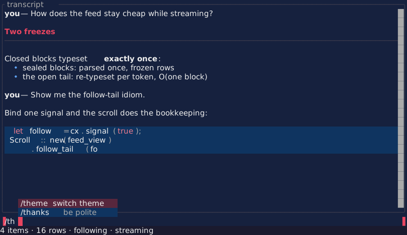
Honesty notes. Cells under a kitty/iTerm2/sixel image are not the
picture — the terminal shows pixels the cell plane cannot see.
Driver::screenshot() stamps those placements from the live session
bookkeeping into Screenshot::pixel_regions(); to_svg renders them as
labeled placeholder veils, text/ANSI exports stay cell-plane-verbatim.
Unicode-mosaic images ARE cells and capture as themselves. VT-model
captures carry no regions (the rig consumes protocol payloads as
counted, unmodeled frames). Hyperlink targets are not captured (a visual
capture has no click surface — the styled debug dumps show them);
blink exports as static; undercurl draws as a straight underline in
both PNG and SVG.
Screenshot::to_png() / to_png_with(PngOpts) / to_bitmap() /
write_png() render the capture as pixels the engine decides itself:
text from an embedded 8x16 bitmap, and the ranges that must TILE — box
drawing, block elements, braille, sextants — drawn geometrically, so
strokes meet exactly at every cell boundary on any machine. Output is
deterministic. to_svg remains the EMBEDDABLE artifact (GitHub renders
it inline in a README) at the cost of depending on the viewer’s
monospace font; the PNG is the faithful one. Capture is on-demand only: nothing here runs per-frame, and an
idle app still costs zero.
Stability and limits
Plain statements of current behavior:
- JPEG decoding covers the 8-bit Huffman frames: baseline, extended sequential, and progressive, in grayscale or YCbCr at 4:4:4, 4:2:2, 4:4:0, and 4:2:0. Arithmetic-coded, lossless, hierarchical, 12-bit, and CMYK variants reject by name. Chroma upsampling is nearest-neighbour. PNG supports 8-bit depths without interlacing (Adam7 rejects by name).
- Animation decodes for animated GIF and APNG. Video does not
decode at all:
.mp4,.mov,.avi,.webm, and.mpgreject by name with a conversion command — their codecs are patent-pooled and out of scope for an in-tree decoder. A decoded sequence is held in memory (64 Mpx budget across its frames). - Screenshots export as text, ANSI, PNG, and SVG. The PNG is the faithful one — the engine draws every pixel, so box-drawing strokes meet and glyph metrics cannot drift; its coverage is ASCII plus the geometric ranges plus ~60 symbols, and anything else (CJK, emoji) draws a labeled placeholder. The SVG is the embeddable one — GitHub renders it inline in a README, at the cost of depending on the viewer’s monospace font, which can stretch glyphs and break stroke joins.
- Sixel uses one palette per emission: multiple live sixel images recolor each other — prefer one per screen. iTerm2 and sixel have no placement model (moves re-emit the payload); only kitty gets placement escapes and true deletes.
- Pixel protocols are verified byte-for-byte against protocol models, not live terminals; unicode mosaic is the universal, always-safe path.
- 3D animation supports LINEAR and STEP interpolation; CUBICSPLINE and
morph weights skip with labels; rotations nlerp (shortest path), not
slerp. Skinning reads
JOINTS_0/WEIGHTS_0(four joints per vertex, linear blend). Textures: base color only, REPEAT wrap, per-triangle mips. - Mosaic color resolution is two colors per cell (the glyph split carries the rest); braille conveys structure, not color; sextant glyphs need a recent font and are an explicit opt-in.
- Ambiguous-width characters follow
unicode-widthnarrow semantics. A terminal configured ambiguous-wide breaks cell layout for every terminal application; the presenter’s cursor discipline bounds the drift but cannot erase it. - Capacity ceilings degrade with labels, never unbounded growth: 4096 distinct long grapheme clusters per surface (then U+FFFD), 65535 hyperlinks per surface (then plain text), with counters exposed.
- Scroll optimization requires DECSTBM/SU/SD compliance — present in
every VT100 descendant — and can be forced off via
PresenterOpts. - Windows compiles clean and its extracted logic is unit-tested on every host, but it has not yet run on a live Windows machine; treat a first Windows deployment as a beta event. macOS and Linux are the live-verified platforms.
Extensions family — sibling crates on this API
Diagram-class capability ships OUTSIDE the core crate as sibling crates built on the public API above (ADR-0004: install only when needed, no cargo features, no private hooks). Each crate carries its own rustdoc — this guide does not duplicate it; the family guide with selection advice and worked examples is graphs-and-diagrams.md.
abstracttui-graph— graph auto-layout (GraphDesc -> Layout:layeredsugiyama-lite,forcebounded seeded placement,gridlabeled fallback; honesty markers for broken cycles and degradations) andGraphView(cards, canvas-stroke edges, selection/pan/tooltips, zero idle).abstracttui-mermaid— honest-subset mermaid: an exhaustive spelling table (the contract, shipped verbatim in the crate docs), flowcharts/flat-state compiled ontoabstracttui-graph, solverless sequence diagrams, atomic fallback to the verbatim code fence with a named reason and a mermaid.live escape link.